Intro to data visualization with Tableau
UBC Library Research Commons
Pre-workshop setup
- Install Tableau Public or Tableau Desktop
- Download Labour Force Survey sample dataset
- Create Tableau Public account (optional)
The UBC Vancouver campus is located on the traditional, ancestral, and unceded territory of the xʷməθkʷəy̓əm (Musqueam), səlilwətaɬ (Tsleil-Waututh), and Skwxwú7mesh-ulh Temíx̱w (Squamish) peoples.
Learning objectives
- Recognize the characteristics of an effective visualization
- Format data for visualization
- Create a simple visualization using Tableau
Tableau Public
Limitations of the free version
- Visualizations cannot be saved locally
- Dataset limit of 1M records
- Cannot connect databases
Outline
| 0:10 | Visualization basics |
| 0:25 | Preparing your data |
| 0:30 | Introducing the Tableau interface |
| 0:45 | Break |
| 0:50 | Creating graphs |
| 1:20 | Saving your work |
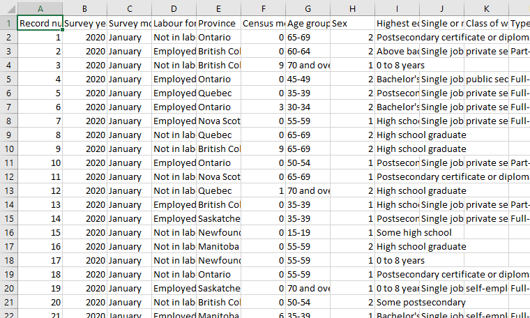
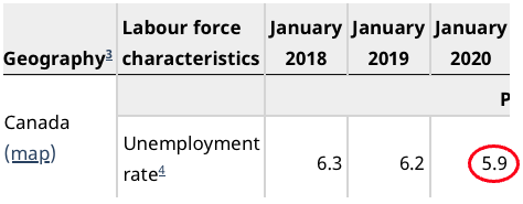
Source data
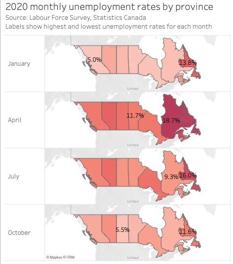
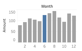
Sample map output
“Data visualization is the graphical display of abstract information for two purposes: sense-making (also called data analysis) and communication.”
-Stephen Few, What is Data Visualization
Preattentive processing
The eye and brain’s ability to process certain visual properties almost instantly, without conscious effort.

Figures on this and the next slide from Stephen Few, “Tapping the Power of Visual Perception” http://www.perceptualedge.com/articles/ie/visual_perception.pdf
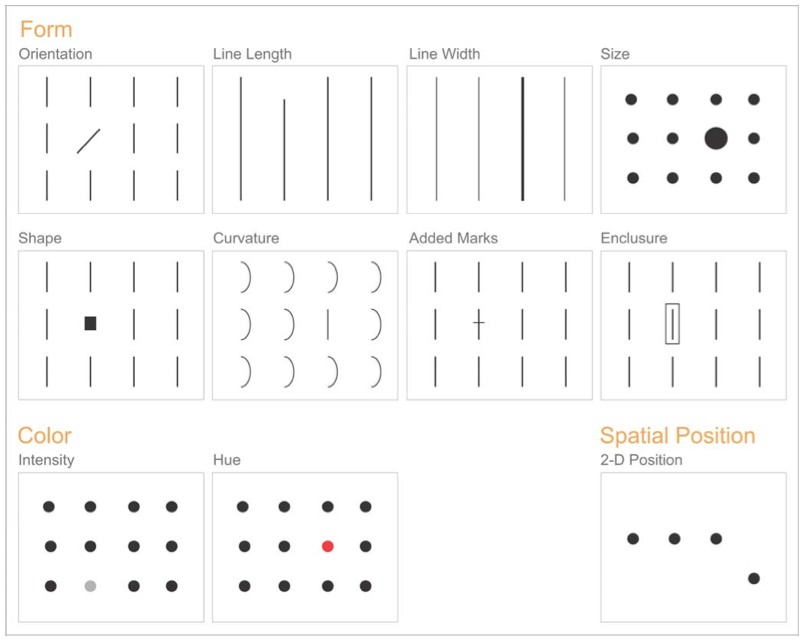
Encoding quantities: length and size

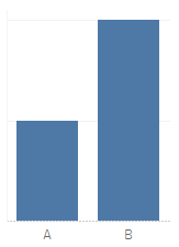
Remove unnecessary content to focus the viewer
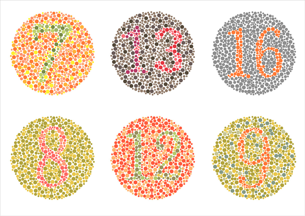
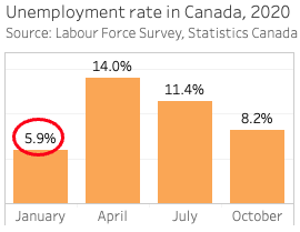
Source: Jeffrey Shaffer, https://www.tableau.com/about/blog/2016/4/examining-data-viz-rules-dont-use-red-green-together-53463
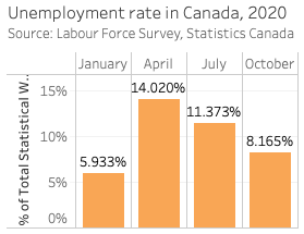
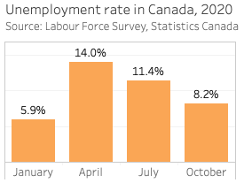
Use colors intentionally to encode information

Some guiding principles
- Choose clarity over variety
- Reduce burden on the reader
- Present data with integrity
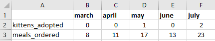
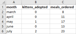
Preparing your data
Each measure in one column
Know your dataset
- How is it formatted?
- How many records are there?
- What are the variable labels?
- Is there a user guide or data dictionary?
Checking your work
Statistics Canada table 14-10-0017-02, Labour force characteristics by province, monthly, unadjusted for seasonality.