3. Building with AI: Build a Real Analysis in 30 Minutes
| Duration: 30 min | Tools: Cursor, Python (pandas, matplotlib) |
Only use Cursor with files that can be made public. All files in a Cursor workspace may be indexed and shared with AI tools, even if you don’t enter them into the chat. Never use Cursor with personal or confidential data.
More detail: UBC AI guidance.
Learning objectives
By the end of this workshop, you will know:
- How to write focused prompts for association analysis in pandas and matplotlib
- How to build evidence using data checks, summary tables, and plots
- How to compare likely predictors of
body_mass_gand explain your reasoning
In this workshop, you will use AI prompts to build a short evidence-based report that answers one question:
What variables are most associated with penguin body mass?
The Project: Body Mass Association Report
Create a new Jupyter notebook (.ipynb) for this project. This format works great in Cursor and Google Colab, so your code outputs appear just like a report.
Build your workflow step by step below using Cursor Chat. By the end, your report should include:
- a quick data quality check,
- a summary of body mass across groups,
- numeric and visual evidence for likely associations,
Step 1: Load & Inspect (5 minutes)
Sample prompt:
Load the penguins.csv file using pandas.

- Print how many rows there are.
- Show the column names.
- Show the data types for each column.
- Show how many missing values are in each column.

Also, list which columns you think could help predict body_mass_g.
Expected output:
import pandas as pd

penguins = pd.read_csv("data/penguins.csv")
print("Rows:", len(penguins))
print(penguins.columns.tolist())
print(penguins.dtypes)
print(penguins.isna().sum())

candidate_predictors = [
    "bill_length_mm",
    "bill_depth_mm",
    "flipper_length_mm",
    "species",
    "sex",
    "island",
    "year",
]
print("Candidate predictors:", candidate_predictors)
Step 2: Clean Data (5 minutes)
Sample prompt:
Context: Keep the same body_mass_g question.
Task: Remove rows with missing values in body mass and key predictor columns.
Constraints: Use pandas; keep code simple.
Format: Show row count before/after and percent rows retained.
Expected output:
cols_needed = [
    "body_mass_g",
    "bill_length_mm",
    "bill_depth_mm",
    "flipper_length_mm",
    "species",
    "sex",
    "island",
    "year",
]

penguins_clean = penguins.dropna(subset=cols_needed).copy()
before = len(penguins)
after = len(penguins_clean)
print("Before:", before, "| After:", after)
print("Retained (%):", round(after / before * 100, 1))
Use penguins_clean for all remaining steps so your comparisons are consistent.
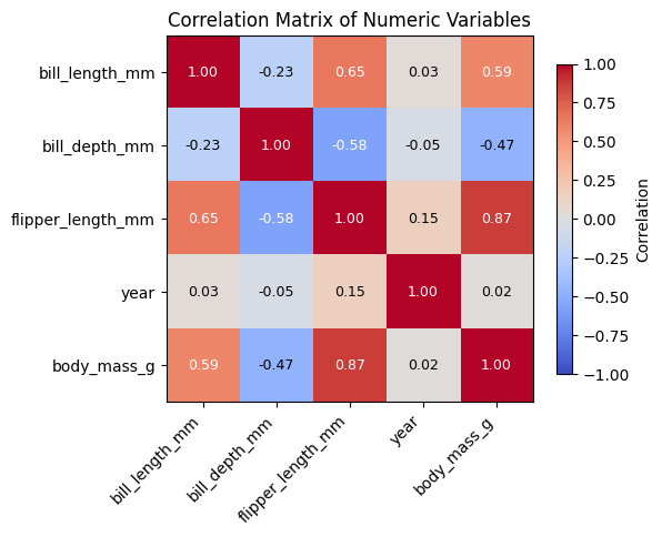
Step 3: Association Table (5 minutes)
Sample prompt:
Continue exploring which factors are linked to body mass with cleaned data
Generate:
1) a summary table by category showing how many cases are in each group and the average body mass
2) (Optional, if interested) a table ranking other numeric variables by how strongly they are correlated with body mass
Constraints: Use only pandas.
Format: Print the tables, with numbers rounded for easy reading.
Expected output:
species_summary = (
    penguins_clean.groupby("species")
    .agg(
        n=("body_mass_g", "count"),
        avg_body_mass_g=("body_mass_g", "mean"),
    )
    .round(1)
)

print("Species summary:")
print(species_summary)
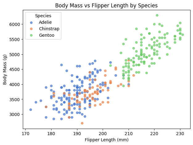
Step 4: Visualization (10 minutes)
Sample prompt:
Context: Keep the same body_mass_g question and use penguins_clean.
Task: Create a scatter plot of flipper_length_mm (x) vs body_mass_g (y),
colored by species, with clear labels and legend.
Then add an optional box plot of body_mass_g by species.
Constraints: matplotlib only.
Format: show plots and include a one-line interpretation.
Expected output:
import matplotlib.pyplot as plt

species_colors = {
    "Adelie": "#4878d0",
    "Chinstrap": "#ee854a",
    "Gentoo": "#6acc65",
}

fig, ax = plt.subplots(figsize=(6, 4))
for sp in ["Adelie", "Chinstrap", "Gentoo"]:
    sub = penguins_clean[penguins_clean["species"] == sp]
    ax.scatter(
        sub["flipper_length_mm"],
        sub["body_mass_g"],
        c=species_colors[sp],
        label=sp,
        alpha=0.7,
        s=20,
    )

ax.set_title("Body Mass vs Flipper Length by Species")
ax.set_xlabel("Flipper Length (mm)")
ax.set_ylabel("Body Mass (g)")
ax.legend(title="Species")
plt.show()

# Optional (if time permits): box plot of body mass by species
fig, ax = plt.subplots(figsize=(6, 4))
penguins_clean.boxplot(column="body_mass_g", by="species", ax=ax)
ax.set_title("Body Mass by Species")
ax.set_xlabel("Species")
ax.set_ylabel("Body Mass (g)")
plt.suptitle("")
plt.show()
Example scatter output:
Example box plot output:
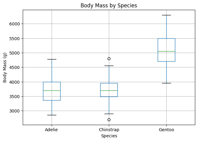
Interpretation hint: Look for stronger trend patterns, clearer group separation, and how much overlap exists.
Next Steps
Pick one to extend your analysis:
- Add a simple linear regression prompt (predict
body_mass_gfromflipper_length_mmandbill_length_mm) - Compare associations separately for each species and see if ranking changes
- Test sensitivity: compare results from
dropna()vs another missing-data strategy - Save your summary and correlation tables to CSV for your report appendix
Other Observations You Could Explore
- How does body mass vary by island or year?
- Does flipper length differ by species or sex?
- Are bill dimensions related to each other?
- Which variable best separates the species?
What questions come to your mind? Are there other things you’re curious about in the data that you’d like to explore?
Ethics and responsible use
AI can speed up coding. However make sure to check outputs against your data, watch for biased defaults or hallucinations, and follow your instructor’s and institution’s rules for coursework and data. Use AI as a helper—not as a substitute for understanding what your code does.
For UBC-specific expectations and links to official generative-AI guidance, see UBC AI guidance.
Key Takeaways
- Start with one question — keep every prompt tied to the same analysis goal
- Build evidence step by step — data checks, association tables, and targeted plots
- Use AI to draft, then verify — check outputs against your data before concluding
- Report clearly — state strongest associations and one limitation in plain language
Resources
- Cursor docs
- pandas documentation
- Matplotlib documentation
- UBC AI guidance — policies and expectations for generative AI at UBC
Previous: 2. Data Analysis & Visualization
Congratulations! You now know how to use AI prompts to build a focused, report-style analysis from data to conclusion.
Loading last updated date...