Tasks
Table of contents
Introduction
Data import
How to import .csv or .txt files into Excel
Make sure to extract both files from the downloaded archive before the data import!
Step 1
Open a new workbook.
Step 2
Choose File -> Import in the Excel menu
Step 3
Select the CSV file type and select the bc-popular-boys-names.csv file
Step 4
In the Text Wizard select Delimited and choose Semicolon as the delimiter. Make sure that the preview looks correct 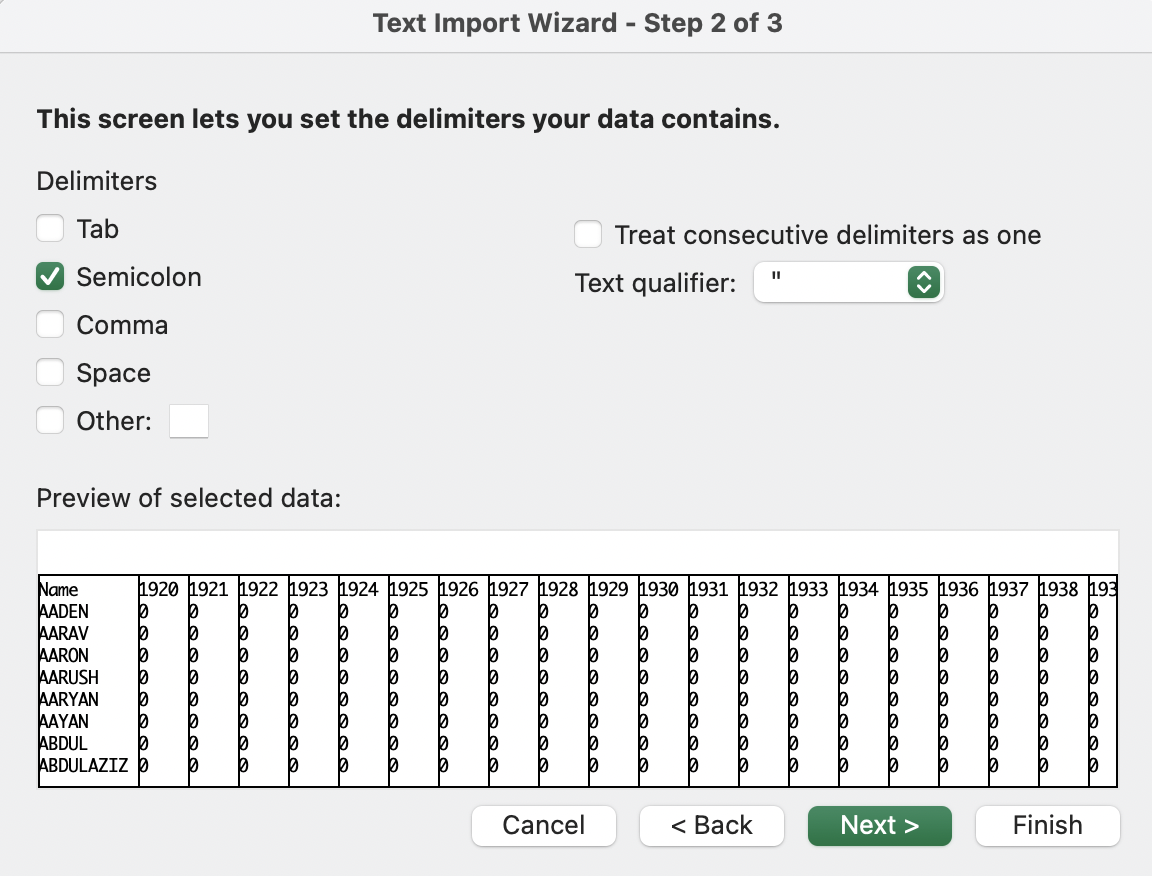
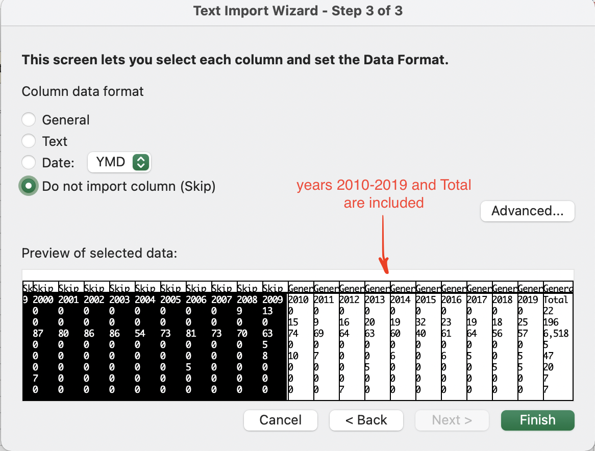
We are only planning to use the data from the last 10 years (2010-2019). Therefore, the columns for 1920-2009 can be skipped.
Step 5
Click on the 1920 column and select the Do not import column. Press Shift and scroll down to the column for 2009, click on it and click on the Do not import column again. Make sure that only columns 1920-2009 are labeled as Skip. Other columns (Name, 2010, 2011, …, 2019, Total) should be labeled General. 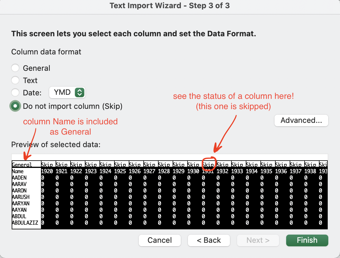
Step 6
Rename the current sheet to “Boys” and follow the same procedure for the Girls data (file bc-popular-girls-names.csv)
Data Operations
Combining sheets
Working with two (or more) sheets simultaneously
We now have two sheets with the same structure (Name, years 2010-2019, and Total) for boys and girls.
Suppose we want to add another column Max Year to store the maximum value in the period 2010-2019 for each name. If the sheets have the same structure, we can do it simultaneously:
Step 1
With the Boys sheet open, press Shift and click on the Girls sheet. Make sure both sheets are selected: 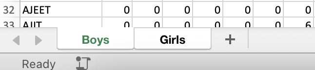
Step 2
Continue to work on the Boys sheet. Add a name for the new column, for example, Max Year.
Step 3
Add formula to the second cell to select the maximum over the ten years period.
Formula (click to open)
`=MAX(B2:K2)`
Step 4
Drag the formula down until the last row.
Easy way to drag the formula down
Double-click the bottom right of the cell (little square thingy that you usually drag down)
Step 5
Now switch over to the Girls sheet. The new column should appear there as well. Note: Due to the difference in the number of rows, for Girls sheet formula is filled until the 2000th row. You can drag it down further manually or use a shortcut from the previous step.
Index-Match
For the Max Year column, it can be interesting to see not the maximum value itself, but rather the year during which this maximum value was captured. This may be done using a combination of INDEX() and MATCH() formulas.
Step 1
Select both sheets using Shift, similar to how we did it in the last exercise.
Step 2
First, we need to find what column matches the maximum value. To do that, we can use the MATCH() function that has the following syntax: =MATCH(lookup_value, lookup_array, [match_type])
Answer (click to open):
`=MATCH(MAX(B2:K2),B2:K2,0)`
Step 3
After getting the index of a column that has a maximum value, we need to get the name of that column (or a year, corresponding to this column). Let’s use INDEX() for that purpose: =INDEX(array, row_num, [column_num])
Answer (click to open):
`=INDEX(B1:K1,1,MATCH(MAX(B2:K2),B2:K2,0))`
Step 4
The combination of INDEX and MATCH gives us the exact year in which the maximum was reached. However, if we drag the formula now, the array argument for INDEX will change, so we need to fix it using the absolute references:
Answer (click to open):
`=INDEX($B$1:$K$1,1,MATCH(MAX(B2:K2),B2:K2,0))`
Step 5
Drag the formula down to fill all the cells.
Named Range
In the formula for the Max Year we have an absolute reference to lookup the column names ($B$1:$K$1), and a relative reference to the number of uses corresponding to each individual row (B2:K2).
For the usability and overall clarity (for example, if you are sharing your workbook with someone else who may wonder what the formula means), we can fix the absolute reference and give it a name, similar to creating variables when programming.
Step 1
On the Formulas tab select Define Name 
Step 2
Enter a name for the data range, for example, years
Step 3
Since we are working simultaneously with two sheets it is better for the Named Range to be independent of the sheet name. Therefore, you can specify the following range: =$B$1:$K$1 (do not forget the equal sign in front) Click OK.
Step 4
You can now rewrite the formula in the M2 using the years Named Range:
Answer (click to open):
`=INDEX(years,1,MATCH(MAX(B2:K2),B2:K2,0))`
Data Exploration
Conditional Formatting
What we want to do next, is to explore our data a bit and to estimate the range of values met there. We can use Conditional Formatting to highlight cells with colors depending on their values:
Step 1
Go to the Boys sheet and select columns A-K. While holding Ctrl (Cmd for Mac), unselect the column names, so they would not be included in the calculations.
Step 2
In the Home tab click on Conditional Formatting -> Top/Bottom Rules -> Bottom 10%. Change the percent to be 1% and click OK.
We can see that there are many zeros in our data. We can use a logical formula to fix that and select only values that have 10 non-zero observations.
Logical Functions
Step 1
Create a new column Non-Zero Obs.
Step 2
We will use COUNTIF to get the number of non-zero inputs for each row. The function uses the following syntax: COUNTIF(range,criteria) Note: When specifying criteria, use quotation marks (“”).
Answer (click to open):
`==COUNTIF($B2:$K2, ">0")`
Step 3
Drag the formula down. Ungroup the sheets and turn on the filter for the new column (Data -> Filter). Select only rows with 10 non-zero observations
Sparklines
Another useful tool in data exploration is sparklines. For our workshop, we will only apply sparklines on a small sample of data from the Girls sheet.
Step 1
First, apply a filter to the column names (Data -> Filter)
Step 2
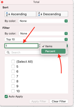
Apply a filter for the Total column. Choose option Top 10, change number to be 1, and select percent instead of items. You should have 26 items selected. 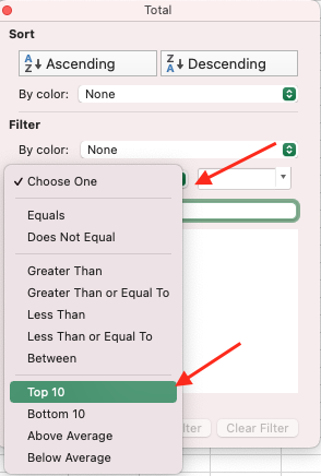
Step 3
Select data for individual years (not including column names) and in the Insert tab select Sparklines
Step 3
Select data for individual years (not including column names) and in the Insert tab select Sparklines -> Line and select an empty column to place sparklines to: 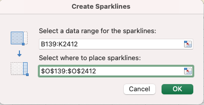
Statistical Tests and Formulas
Excel may not only be used for exploratory data analysis but is also capable of performing a range of statistical tests. We are going to use our baby names data to test a couple of theories.
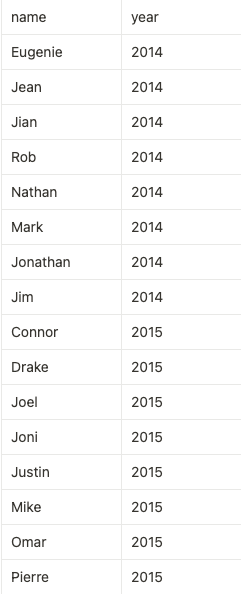
Here are the first names of famous Canadians in 2014 and 2015, extracted from Google Trends:
First, we are going to export this data and find the numbers for corresponding names used in BC.
Data From Picture
There are some hidden gems in Excel that not everyone is aware of. One of them is the ability to import the data from the picture (not only screenshots but high-quality photos or scans).
Step 1
To start, save a picture to your computer and add a new sheet to the current workbook.
Step 2
In the Data tab, select Data from Picture -> Picture From File. Select the path to your file and click Open.
Step 3
When the upload is finished, Excel will give you an option to review the data. Since the data is a screenshot of another table, there is little room for an error, so we can click on the Insert Data button. 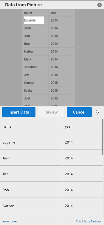
Step 4
If the Data from Picture returns an error, save your file and restart the application. If your version of Excel does not support that feature, use the prepared sheet from here
XLOOKUP
We will now break the data into two periods and compare the use of names. Each period would include 4 years to account for possible fluctuation. One way to get the data for the period would be to first use VLOOKUP() and get the data for each year, then sum it up and compare the summaries. However, there is a simpler way of doing it by using XLOOKUP that returns an array:
Step 1
Add a new column called 2010-2013. For the first name, use XLOOKUP() to get data for the years 2010, 2011, 2012, and 2013. Here is the syntax that XLOOKUP uses: **XLOOKUP(lookup_value, lookup_array, return_array, [if_not_found], [match_mode], [search_mode])** Do not forget to use absolute and relative references where applicable!
Answer (click to open):
`=XLOOKUP($A2,Boys!$A$2:$A$2000,Boys!$B$2:$E$2000,0)`
Step 2
Drag the formula down. You will now see that when the name we search for is present in the data, the formula returns 4 values – one for each year. To sum them up, we can use the SUM() function.
Your formula should now look like this (click to open):
`=SUM(XLOOKUP($A2,Boys!$A$2:$A$2000,Boys!$B$2:$E$2000,0))`
Step 3
Write the formula for the 2016-2019 period.
Your formula should now look like this (click to open):
`=SUM(XLOOKUP($A2,Boys!$A$2:$A$2000,Boys!$H$2:$K$2000,0))`
T-test
Suppose we have the following research question:
Was there a difference between the use of trending names in two time periods?
To answer that, we can use a t-test. The research question itself suggests that we have repetition: two observations for each name. Therefore, we would use a paired t-test.
Step 1
In the Data tab click on Analysis Tool and make sure that Analysis Toolpack is installed. 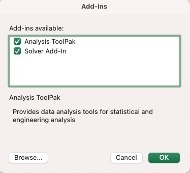
Step 2
Click on the Data Analysis (the icon should appear next to the Analysis Tool in the Data tab) and select t-Test: Paired Two Sample for Means 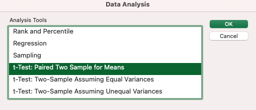
Step 3
Select column values as variables and save output on the same sheet, below the table. Other parameters would be defaults: the null hypothesis is that the difference is 0 and the alpha level is 0.05.
Show settings (click to open):
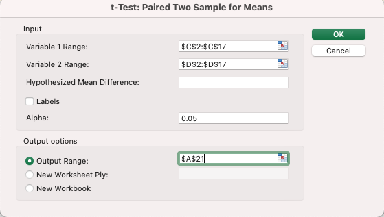
Step 4
You are now able to see and analyze the output. T-tests in Excel perform both one-tail and two-tail options, however, the latter is generally preferred for most cases. We can see that the two-tail p-value of 0.053 is slightly larger than our significance level, therefore, we cannot reject the null hypothesis and reach a conclusion based on that data.
ANOVA
We have another column that has not been used yet – year. What if we will rephrase our research question to be the following:
Was there a difference between the use of trending names of 2014 vs trending names of 2015 in two time periods?
Now we have a variation in the group, so it is a good idea to use ANOVA. The observations are still not independent (as they are in fact repeated measures), so we need to account for that and choose an ANOVA with replication.
Step 1
Open Data Analysis and select Anova: Two-Factor With Replication 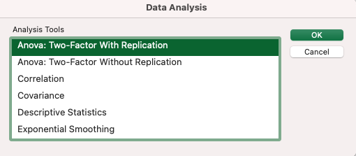
Step 2
The input range should include all three columns, as well as their labels. The number of rows per sample in our data is 8 (8 rows for 2014 and 8 rows for 2015). The alpha level is default and equal to 0.05. Save output to the same sheet.
Show settings (click to open):
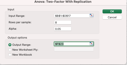
Step 3
We can now see if there is a significant difference between periods, accounting for the variation within-group. The results indicate that neither the sample variation (p=0.79), nor the between-periods (p=0.6), nor their interaction term (p=0.96) were statistically significant.
Pivot Tables and Visualizations
Wide to Long Format
For visualization and data analytics it is better to keep data in the long format (one row per subject). One way how the data can be transformed from wide format to the long is to use Power Query. However, this option is not supported in the latest versions for Mac or Office 365.
In this workshop, we demonstrate how it may be done through the use of Macro.
Step 1
Select Top-10 items from the Boys sheet using the filter.
Step 2
Create a new sheet called “Long Data” with three columns – name, value, and year.
Step 3
First, we will transform observations for one name. Excel allows a to transpose a row through the use of Paste of Special function. Copy the first row of data (including only the values for years from 2010 to 2019).
Switch to the Long Data sheet. Right-click on the first row of the value column and select Paste Special -> Transpose. 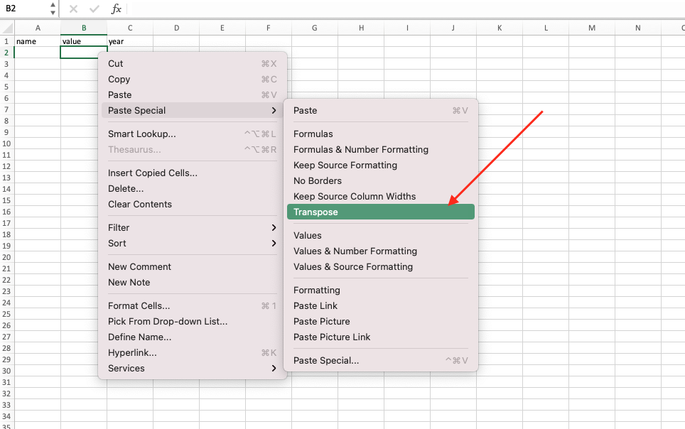
Step 4
Repeat the procedure with the years column names (cells B1-K1 of the Boys sheet) and put them in the year column.
Step 5
Now copy and paste the name from the Boys sheet to the Long Data sheet and fill the ten rows by dragging the cell down. You should have the following result for the first name: 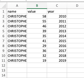
Step 6
The same procedure needs to be repeated 10 times. To make it faster, we can record the manual actions using the macro and then run it several times.
We are going to use a macro with relative references, so before starting, open the View tab and make sure that the Use Relative References option is on. It is also highly important to select correct cells before starting the recording. Select the next empty row in the Long Data sheet, then open the Boys sheet and select the next name (Daniel). Stay on the Boys sheet. In the View tab select Record Macro and give the macro a name, for example, add_name. You would be able to see a small stop button under the Sheet list.
Step 7
Since we use relative references, mostly keys would be used for transferring between cells. Carefully repeat the following sequence of steps:
- Copy the previously selected name (by using Ctrl/Cmd + C or right-clicking on the cell and selecting Copy)
- Switch to the Long Data sheet. Paste the name and drag it down to 9 more cells. When finished, use the right arrow (→) to switch to the
valuecolumn. - Open the Boys sheet again. Using the right arrow (→), switch to the B column and select the observations for years 2010-2019 (use Shift and Right Arrow to expand your selection)
- Switch to the Long Data sheet. Right-click on the selected cell and use Paste as Special to transform the data. When finished, use the right arrow key (→) to switch to the
yearscolumn. - Select already filled years for the previous name (using your mouse or keys, does not matter here). Copy them and click the down arrow key (↓) together with Ctrl (or Command) to return to an empty row.
- Paste the years. When finished, click the down arrow (↓) + Ctrl (Cmd), the down arrow (↓) again and then click the left arrow (←) twice to return to the next empty row of the
namecolumn. This action will allow the macro to be run several times without the user reselecting the next empty row each time the macro finishes. - Return to the Boys sheet and click Stop Recording. Try running your macro! Select a name (for example, Daniel), click View Macros on the View tab, and see if it works
Step 8
Macro produces the code, that you can see by clicking Edit in the View Macros window. Excel uses VBA programming language, so if you have a tricky task you can find some custom macros online. Try our code if your macro does not work correctly (make sure the names are the same and all the right cells are selected!) Click here to get macro code from the Github
Creating a Pivot Table
The transformation of the wide format to a long one is sometimes called “unpivoting” the table. However, the real pivot table format is useful in many other ways, especially for visualizations. Therefore, we will now create a Pivot table from the Long Data.
Step 1
Select column A-C in the Long Data sheet and on the Insert tab choose Pivot Table. Add a pivot table to the new sheet.
Step 2
Add name to the Column area, and value to the Values area. The latter would be automatically converted to the Sum aggregation function.
Step 3
Add year to the Rows area.
You now have a table similar to the one that we were working with in the beginning, but the rows and columns are replaced. This setup would be used for the dashboard visualization in the next step.
Creating an interactive visualization
Step 1
On the Insert tab select Pivot Chart.
Step 2
Right-click the appeared chart and change the type to be a line graph.
Step 3
On the PivotChart Analyze tab select Slicer. Choose name and year.
Step 4
By selecting different years and names, you can now see how the use of names is changing over the years
Changing the chart parameters
Step 1
Add the title to the graph: On the Design tab select Add Chart Element -> Chart Title -> Above Chart
Step 2
Change color palette: On the Design tab select Change Colors. Some Excel versions allow you to add your own color scheme (see here the instruction on how to do it)!
Step 3
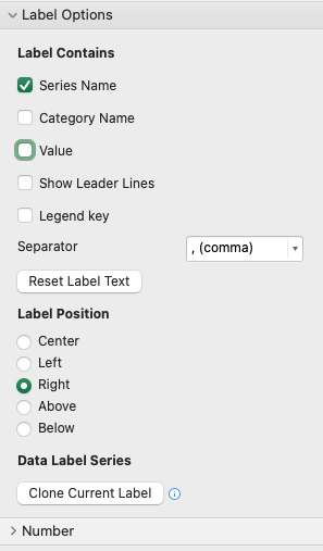
Apply direct labeling to the chart:
- Select the last point of the Data Series
- Click Add Chart Element -> Data Labels -> More Data Labels Options.
- Select Series Name and unselect Value
Step 4
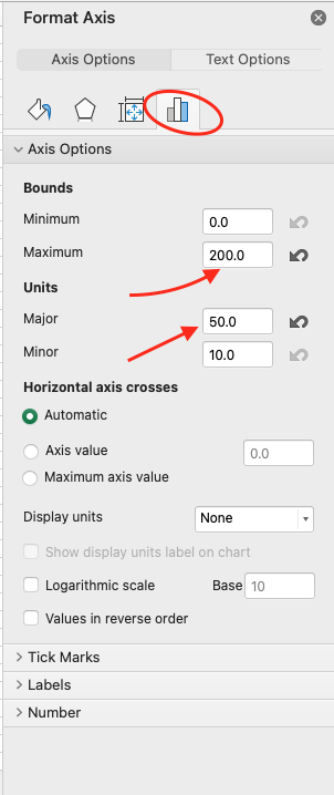
Change the gridlines: Select vertical axis, right-click on them (or choose Vertical (Value) Axis in the Format tab). Click on the histogram icon, change the maximum value to be 200 and major units to be 50 (to increase the spacing between grid lines)