Creating graphs: part 2
In this section we will build on the previous graph to show differences over time and by province. In the process you will explore some other Tableau features.
- Hide elements in a graph
- Use Show Me to change graph type
- Show/Hide headers
- Change Color
- Edit Tooltip
Map: unemployment rate by month and province
You can add complexity or depth to a graph by adding other dimensions or measures to the worksheet. This is a great way to explore your data and Tableau features.
1 Add provinces
Duplicate the unemployment rate bar graph on a new worksheet, then make changes.
- Right-click the “Unemployment rate” tab and select Duplicate
- Right-click the new tab and Rename it Unemployment map
- Drag Province onto the Columns shelf
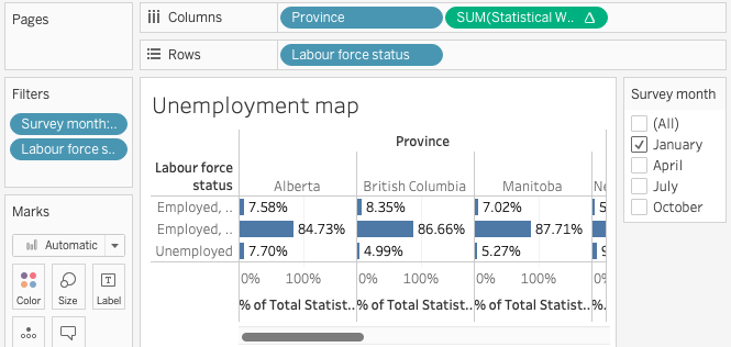
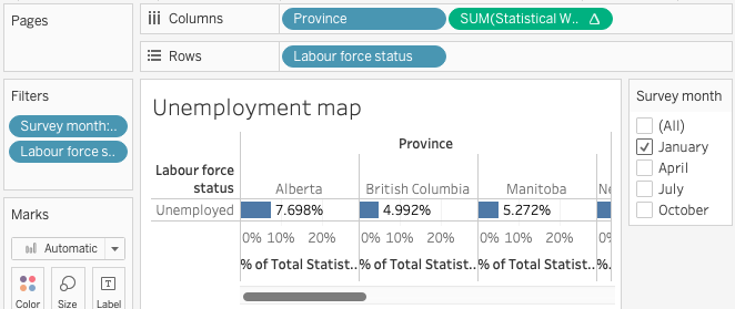
2 Hide unwanted information
With more dimensions the graph it can get cluttered. We’re only interested in the unemployment rate and can make it easier to read by removing the other two categories.
In the “Labour force status” column, right-click each of the two “Employed…” labels and select Hide.
Hide and Exclude behave differently. Exclude removes the corresponding data from the graph and adds a filter to the Filters card. This also removes the data from calculations, which would affect our unemployment rate calculations. If the content you wish to hide from view is used in a calculation choose Hide instead of Exclude.
3 Change graph type
When your data contains geographic names or coordinates Tableau can represent it on a map.
Click the Show Me button in the top right corner and select the shaded map. The Show Me menu indicates which chart types can be used with the measures and dimensions on your worksheet. 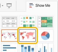

If your map is blank you may need to change the Tableau settings. In the Map menu select Edit Locations, then in the popup window click the drop-down menu for Country/Region and select None.
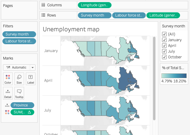
4 Show other months
The map displays information in a smaller space, making it possible to show more information such as change over time.
- Drag Survey month to the Rows shelf, placing it before Labour force status
- Select All in the Survey month filter

5 Format for tidier display
As you add elements to the chart it can become cluttered. Consider removing information that is not required and changing the size to fit your reporting needs.
- On the Rows shelf, right-click Labour force status and select Show Header to toggle visibility of the “Unemployed” column
- Hover over the row and column dividers and drag them to change the map size, if desired
Exercise
With the Marks card you can format many aspects of a graph. Try one or more of the following:
- Change the Colors
- Simplify or customize the Tooltip
- Add labels to the map showing maximum and minimum unemployment rates each month
Loading last updated date...