Thematic Maps
Another kind of map is a thematic map. Writes Statistics Canada: “A thematic map shows the spatial distribution of one or more specific data themes for standard geographic areas.” Thematic maps render the results of spatial analysis. Remember, QGIS defines spatial analysis as:
the process of manipulating spatial information to extract new information and meaning from the original data. Usually spatial analysis is carried out with a Geographic Information System (GIS). A GIS usually provides spatial analysis tools for calculating feature statistics and carrying out geoprocessing activities such as data interpolation.
Below are examples of different thematic maps, all visualizing chestnut street trees by Vancouver neighborhoods.
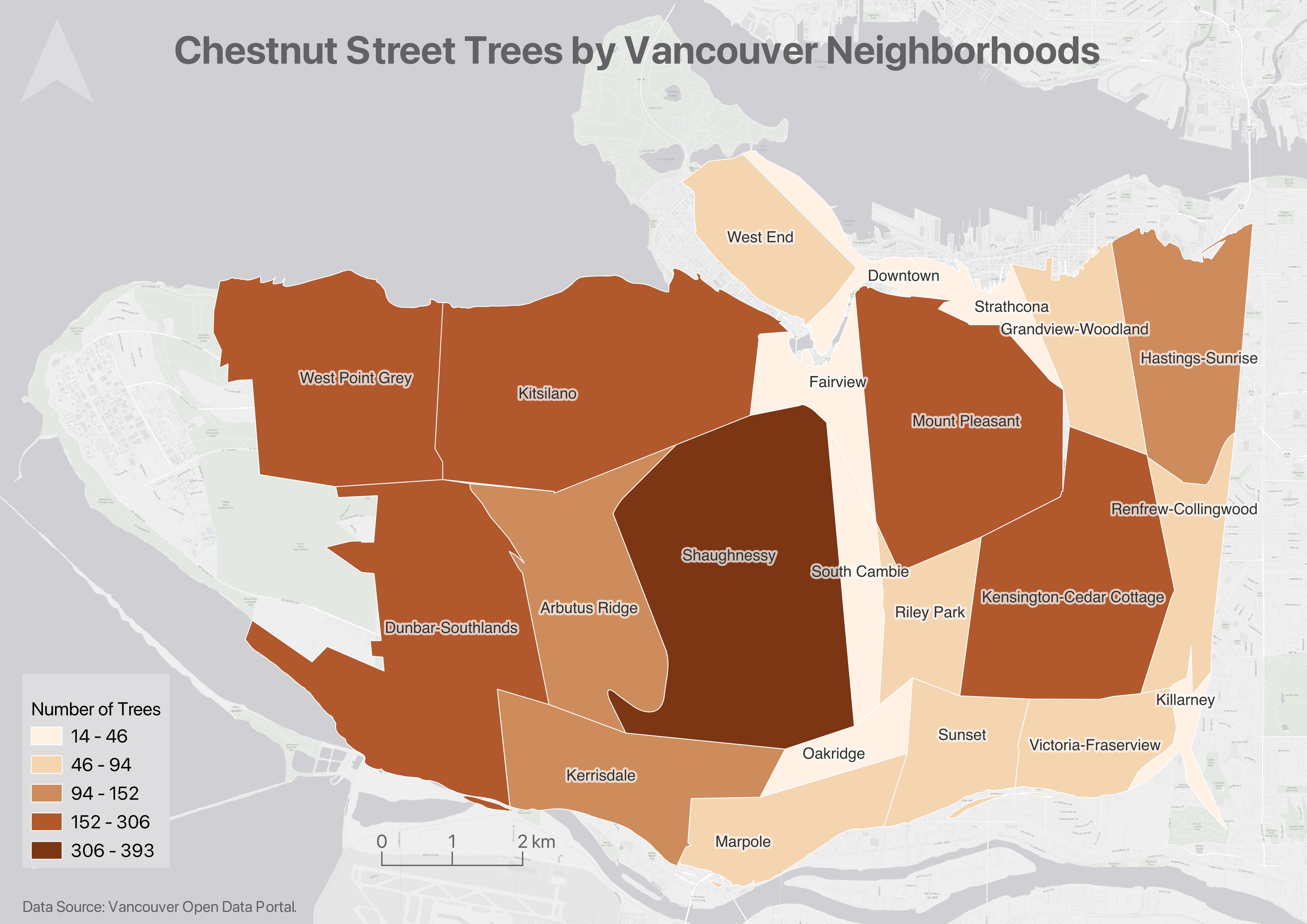
Choropleth maps
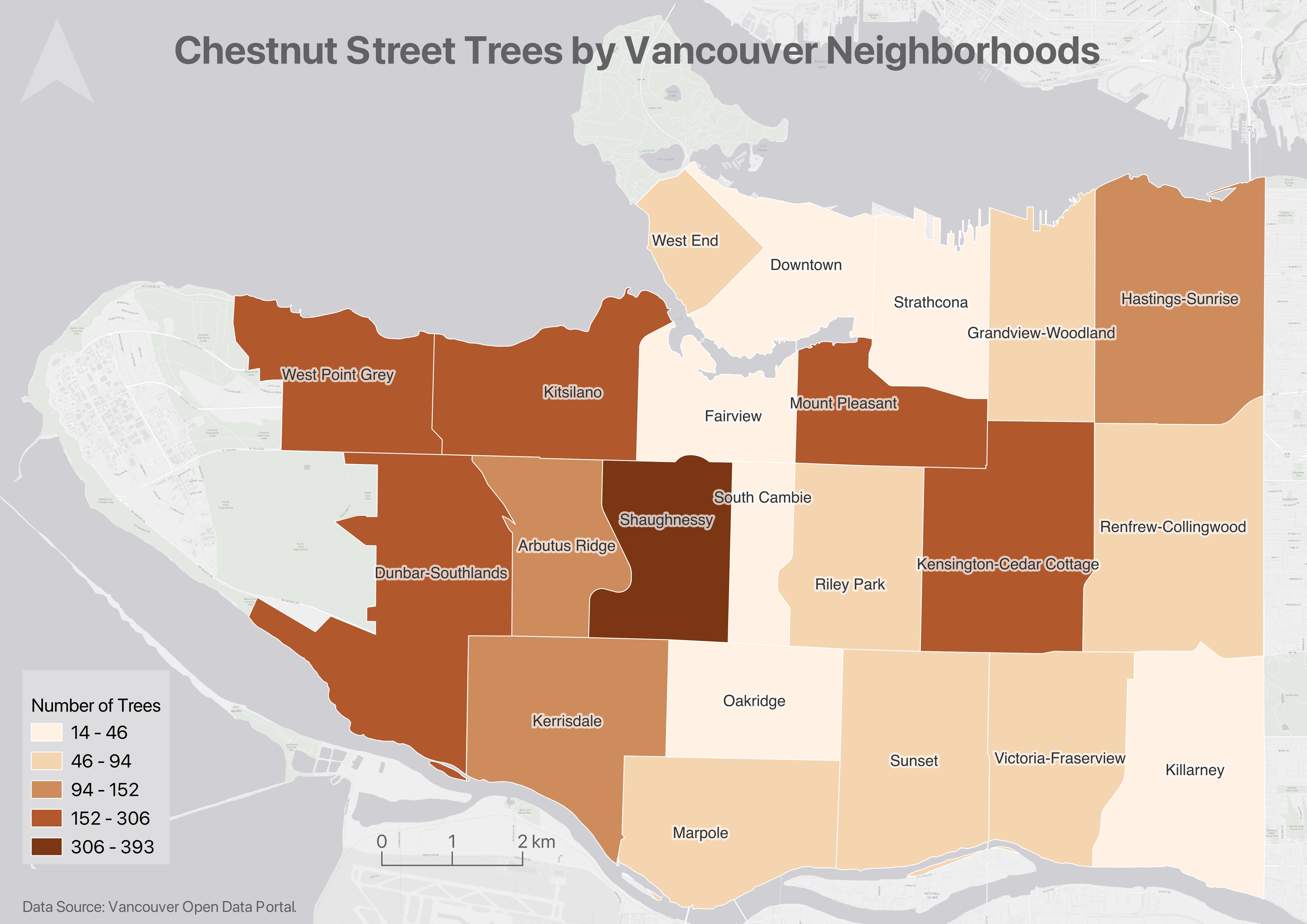
Choropleth maps are useful to visualize and compare the density, frequency, or quantity of a value generalized across standardized geographic areas (such as zip-codes, provinces, or countries). See Axis Map’s guide to choropleth maps for more.
The map below shows total chestnut street trees per Vancouver neighborhood.
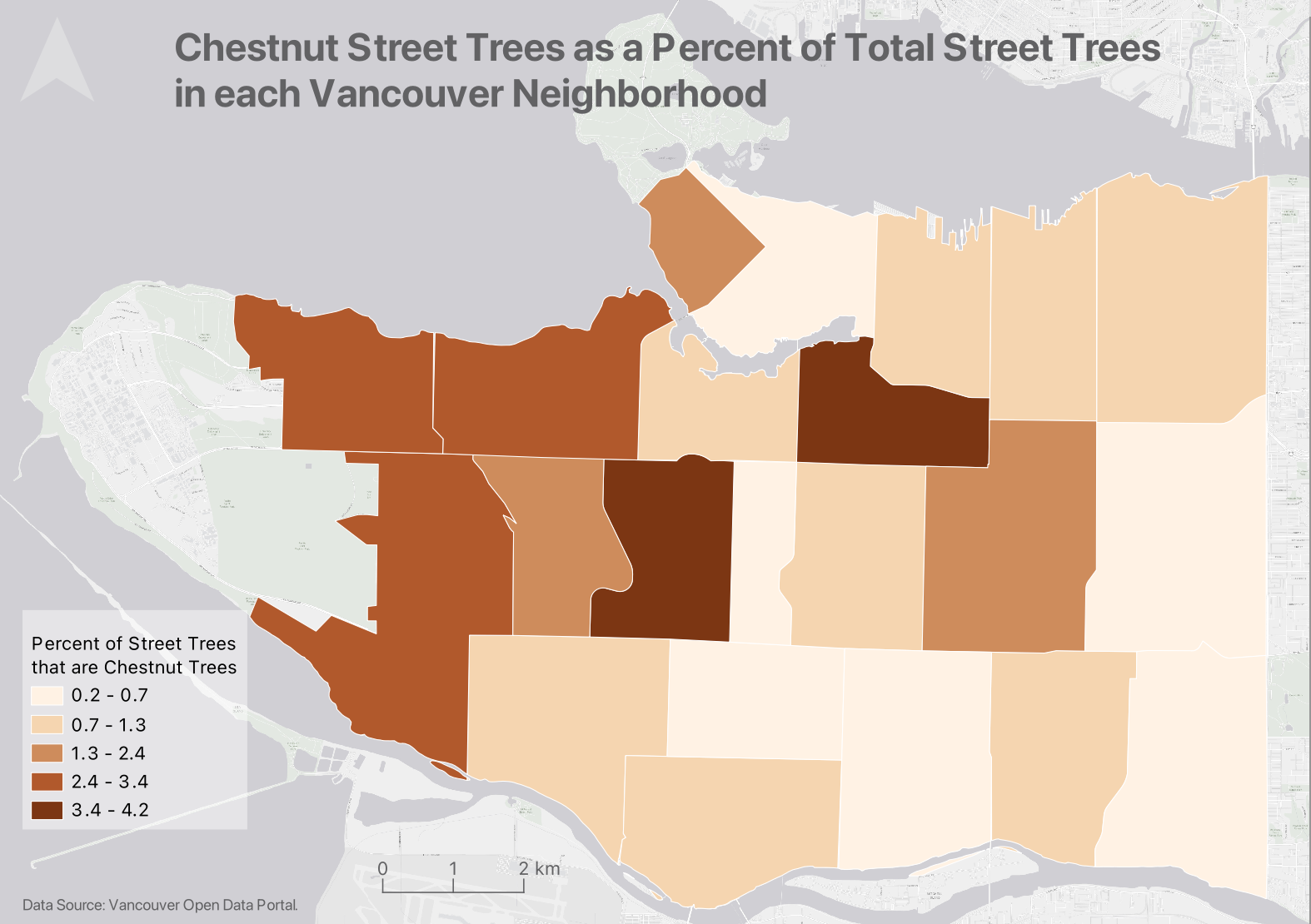
Unless you specifically want to emphasize differences in total number of events/data points, it is best practice to normalize your data when choropleth mapping. Normalization is when you divide the values for each geographic area by something like the area in square kilometers or total population of that area. For instance, mapping winter flu cases across census tracts in British Columbia, you’d want to normalize the total cases in each census tract by that tract’s total population. Normalization enables better comparison across multiple geographic areas. See Axis Maps for more.
The map below shows chestnut street trees as a fraction of total street trees per Vancouver neighborhood.
Proportional Symbol maps
Choropleth maps use a color gradient to convey value differentials, whereas proportional symbol maps use symbol size. Proportional symbol maps are useful to visualize the quantity of something across respective locations. Proportional symbols are quite intuitive, and can be combined with other parameters like color and lettering size to provide rich spatial information. Proportional symbols can even be layered atop a choropleth map. See Axis Map’s guide to Proportional Symbols for more.
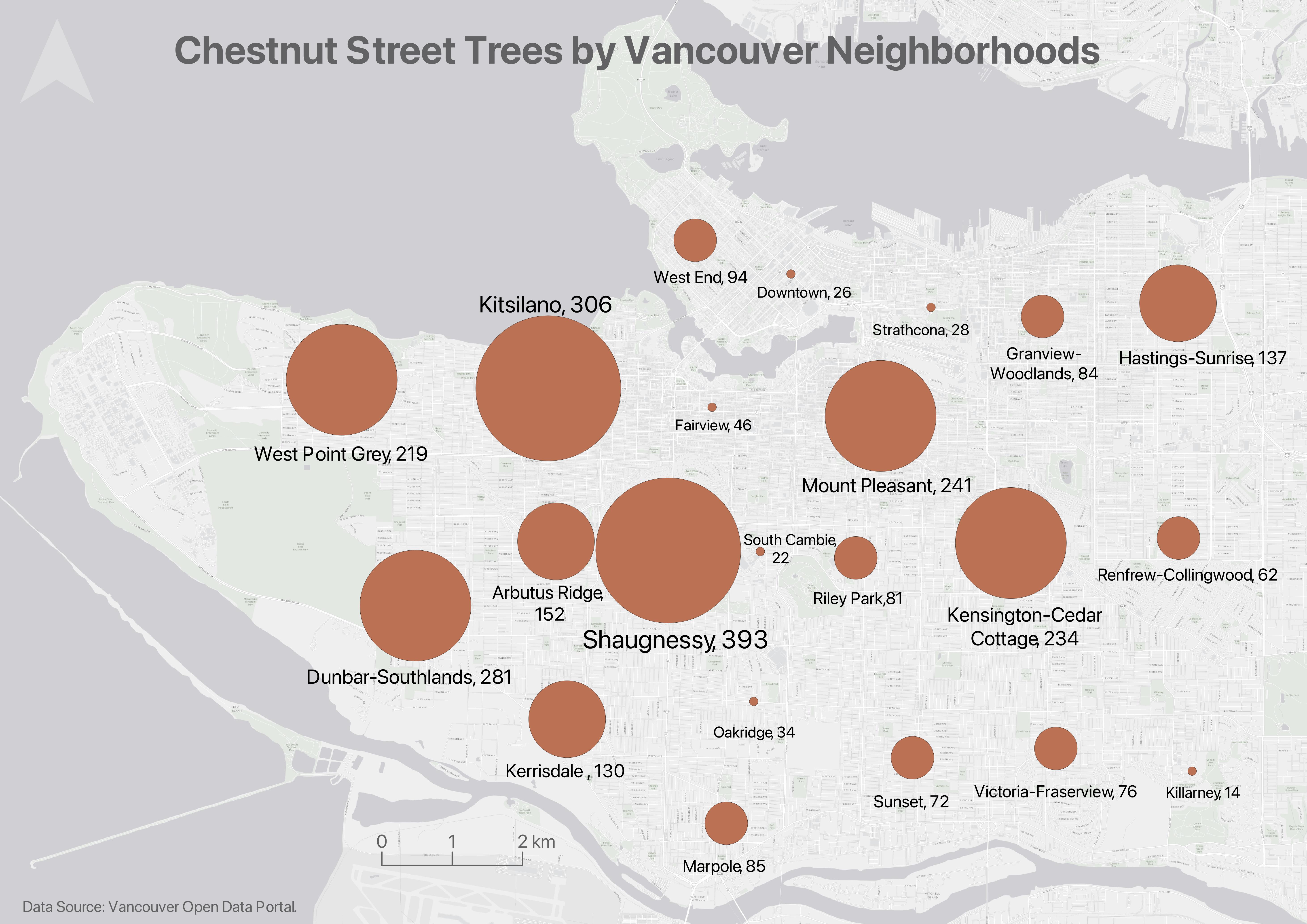
In most cases you do not normalize values when using proportional symbols, as that would reduce the range in difference. If anything, it can be useful to exaggerate the range slightly. While Absolute Scaling renders symbols increasingly larger along a linear scale, Perceptual/Apparent Scaling compensates for the eye’s tendency to reduce difference in sizes close together. See here for more.
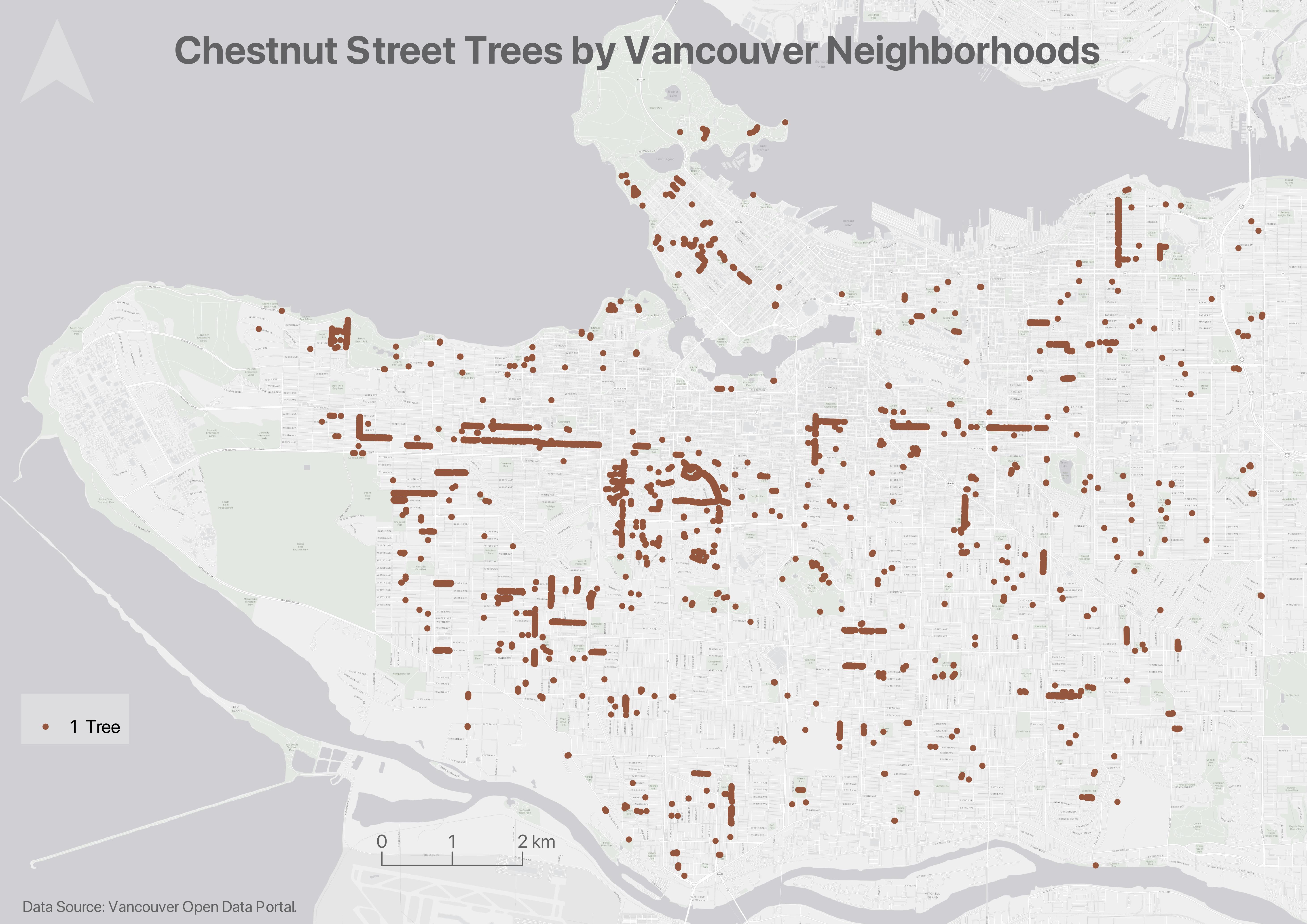
Dot Density maps
Dot density maps are useful in visualizing the concentration and distribution of discrete incidents. Each dot can represent an event (e.g., an earthquake), or a multiple such as 10. Dot Density maps can over-simplify. See Axis Map’s guide to Dot Density Maps for more.
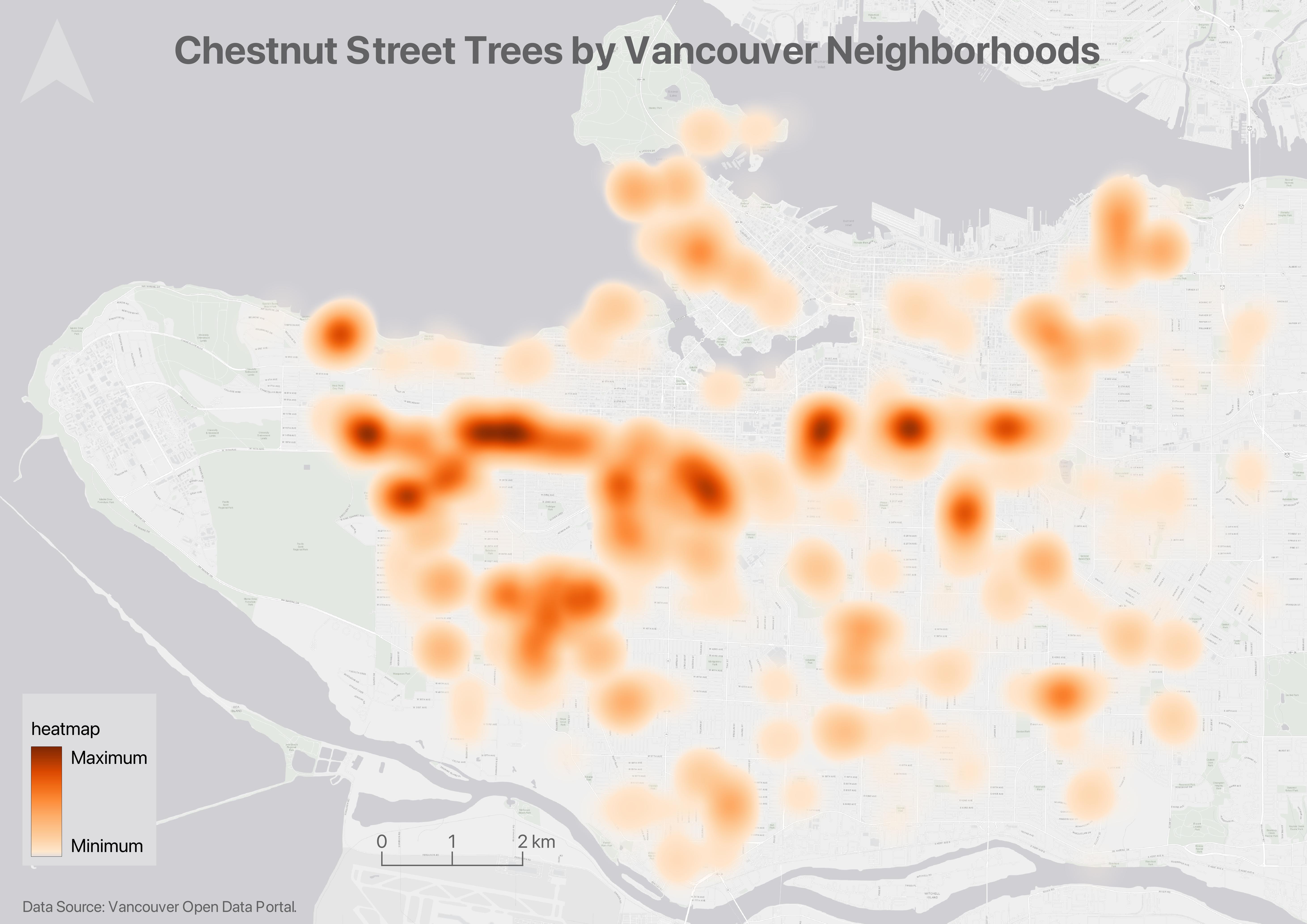
Heatmaps
Heatmaps are useful in visualizing the intensity or frequency of occurrence. Heatmaps can be thought about as generalized dot density maps.
Cartograms
Cartograms distort area to emphasize the value associated with a geographic region. When using cartograms, it’s important to consider whether your audience is already familiar with the un-distorted geography, otherwise they might not glean the added information.
There is a case to be made that all maps are thematic, as the definition of boundaries, borders, names, etc. is a political - and almost always contested - act. In other words, there are no neutral maps that simply, impartially, represent an objective reality or truth. See Crampton and Krygier (2006) or Harley 1992 (1992) for a seminal introduction to critical cartography, or Wang and Liu (2022) for an overview of critical cartography and GIS through the last several decades. See also the classic by Denis Wood, The Power of Maps.
Resources
If you have spatial questions you want to explore with your data, you’ll likely need to perform some kind of spatial analysis within a GIS. Check out Map Production with QGIS, Thematic mapping with QGIS, and Tools and Workflows in QGIS for more on data modification, spatial selections, attribute table calculations, and geoprocessing. If you are still designing your project and unsure as to your output, check out the Research Common’s Designing Spatial Stories workshop, email the Geospatial team at library.gis@ubc.ca, or book a consult.
Loading last updated date...