Making a Choropleth Map
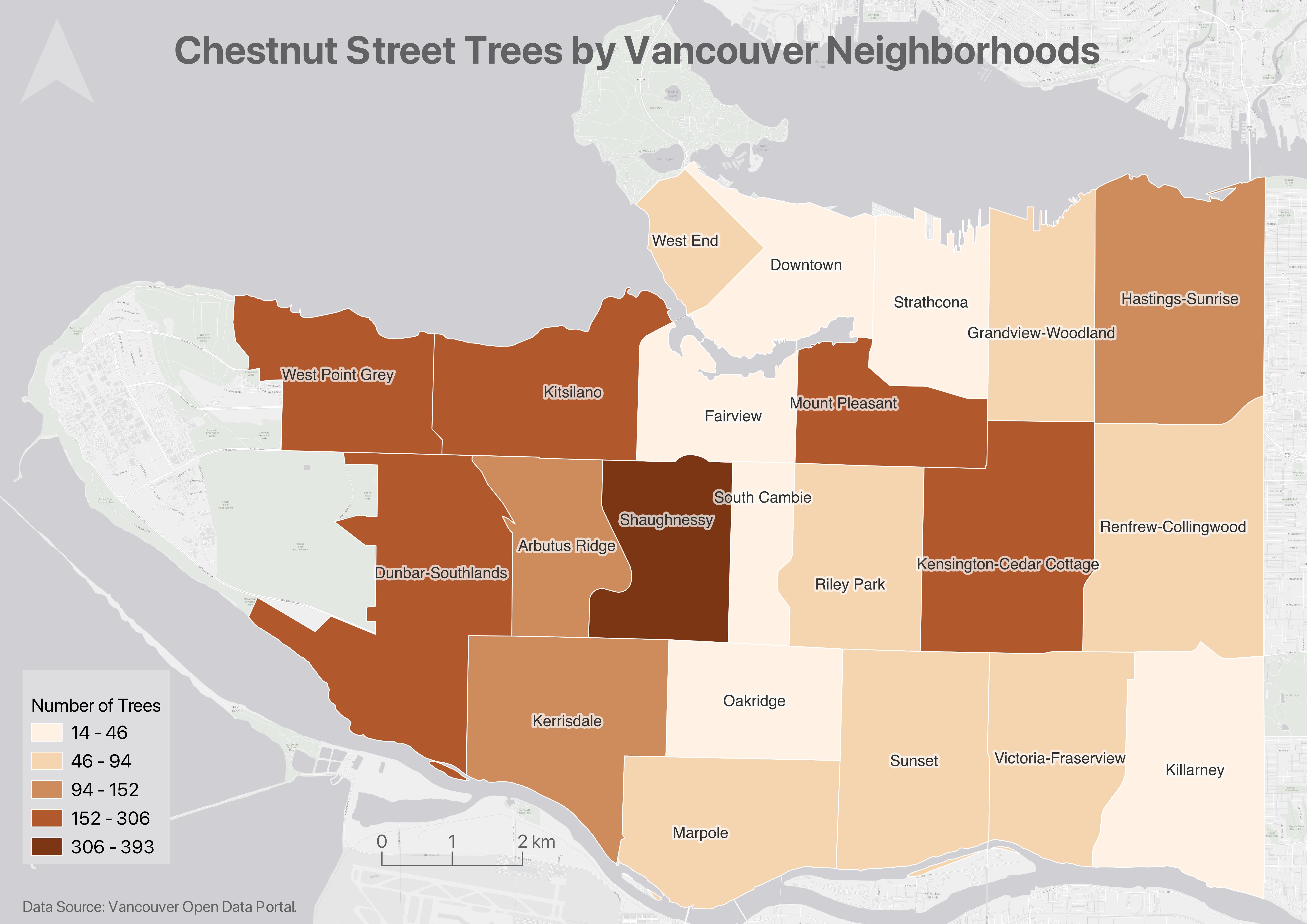
As it is, we can’t glean any information regarding the number of Douglas Firs by simply looking at vanHoodsCount. However, as we saw in the Attribute Table, vanHoodsCount does contain this information. So, what we need to do is change the Symbology of vanHoodsCount to render visible the values in the DougFirs field. We can use either color or symbols to convey the range of total trees. Let’s begin by making a choropleth map, using a color gradient to visualize the number of Douglas Fir street trees in each Vancouver neighbourhood.
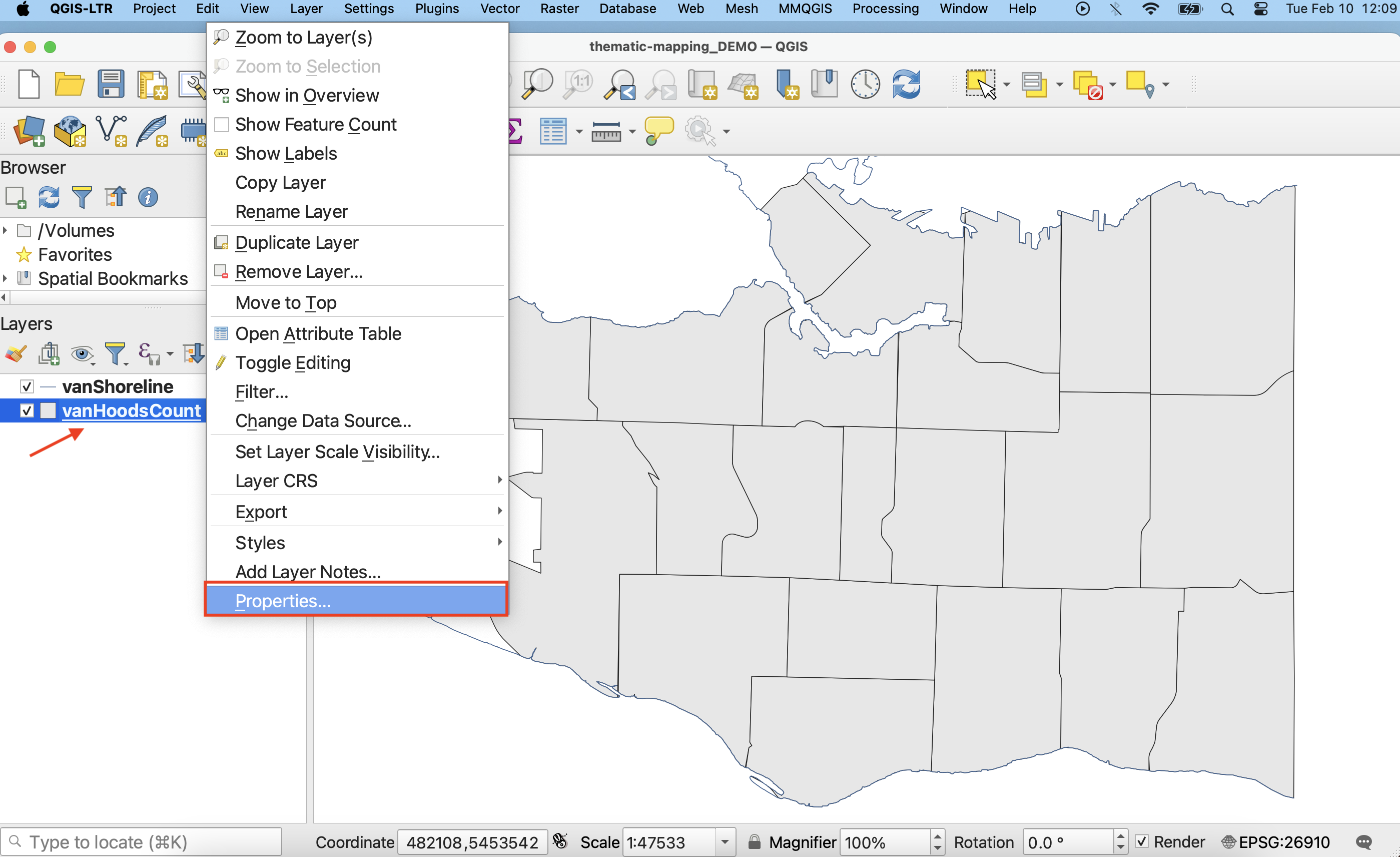
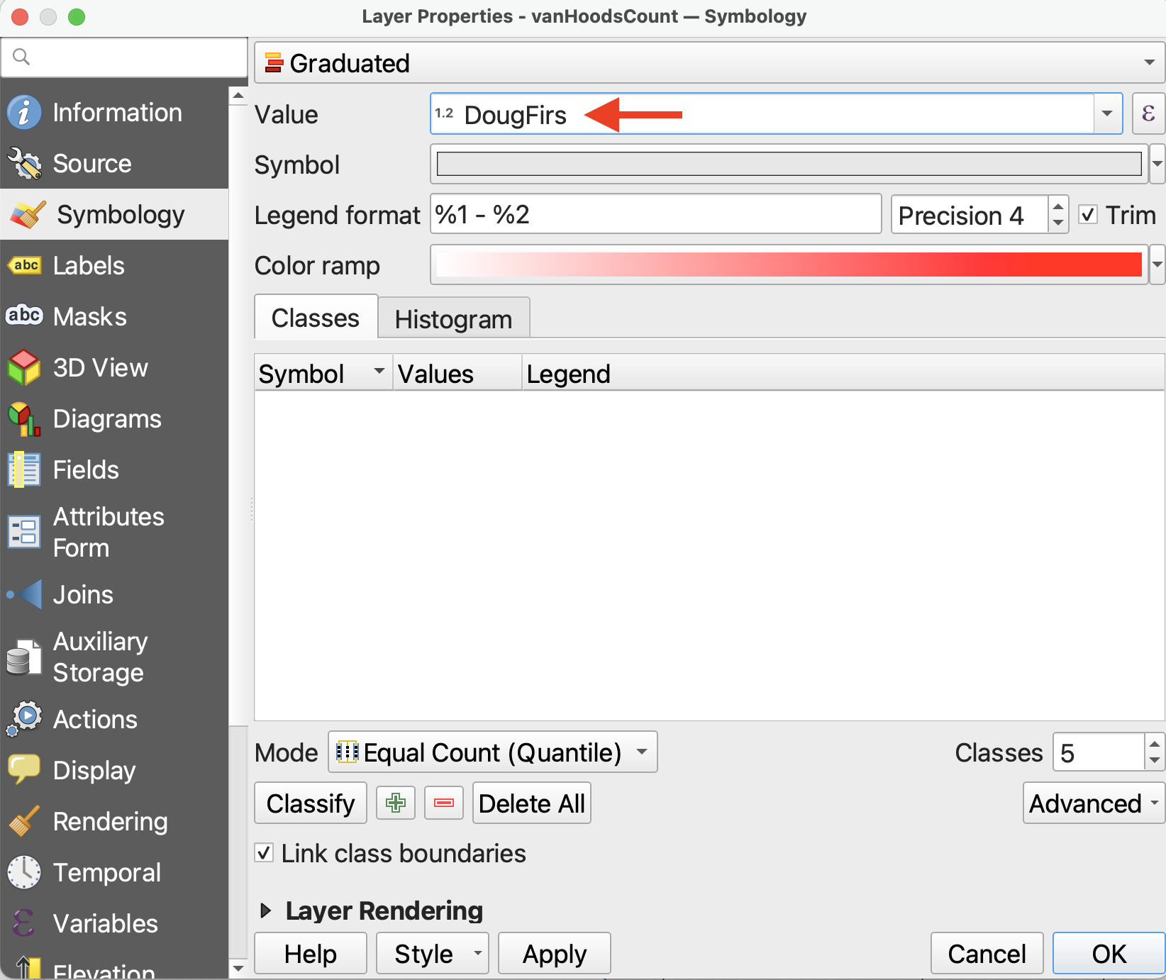
1 In the Layers Panel, right-click on vanHoodsCount and go to Properties. Then, in the Layer Properties window, navigate to the Symbology tab.
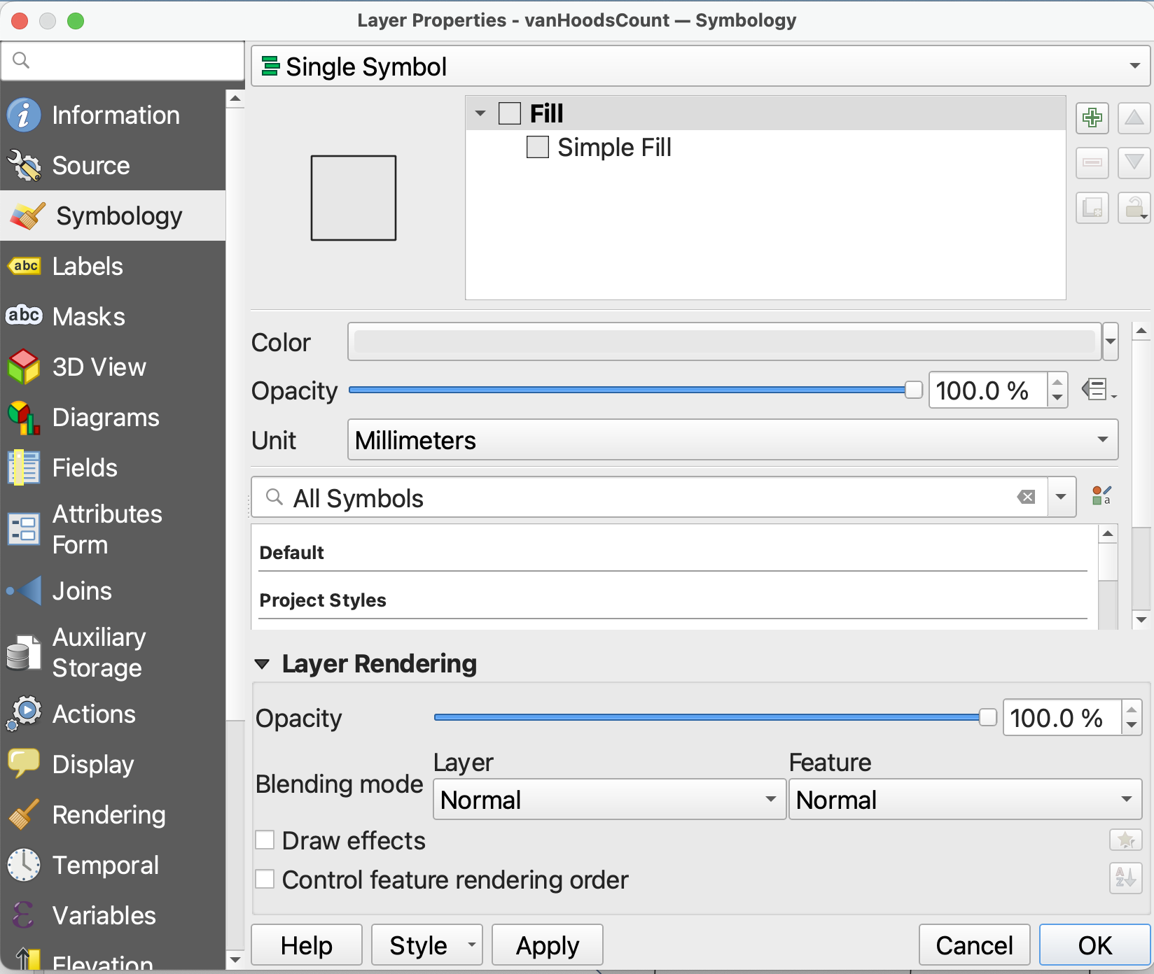
2 At the very top, we can see that the symbology is set to Single Symbol. This means every feature in the dataset is rendered in the same color. Since we want to show a range of values, we need to change the symbology. Click on Single Symbol and from the drop-down, choose Graduated. This will allow you to symbolize each neighbourhood along a gradient of color, with darker colors representing more trees and lighter colors representing fewer.
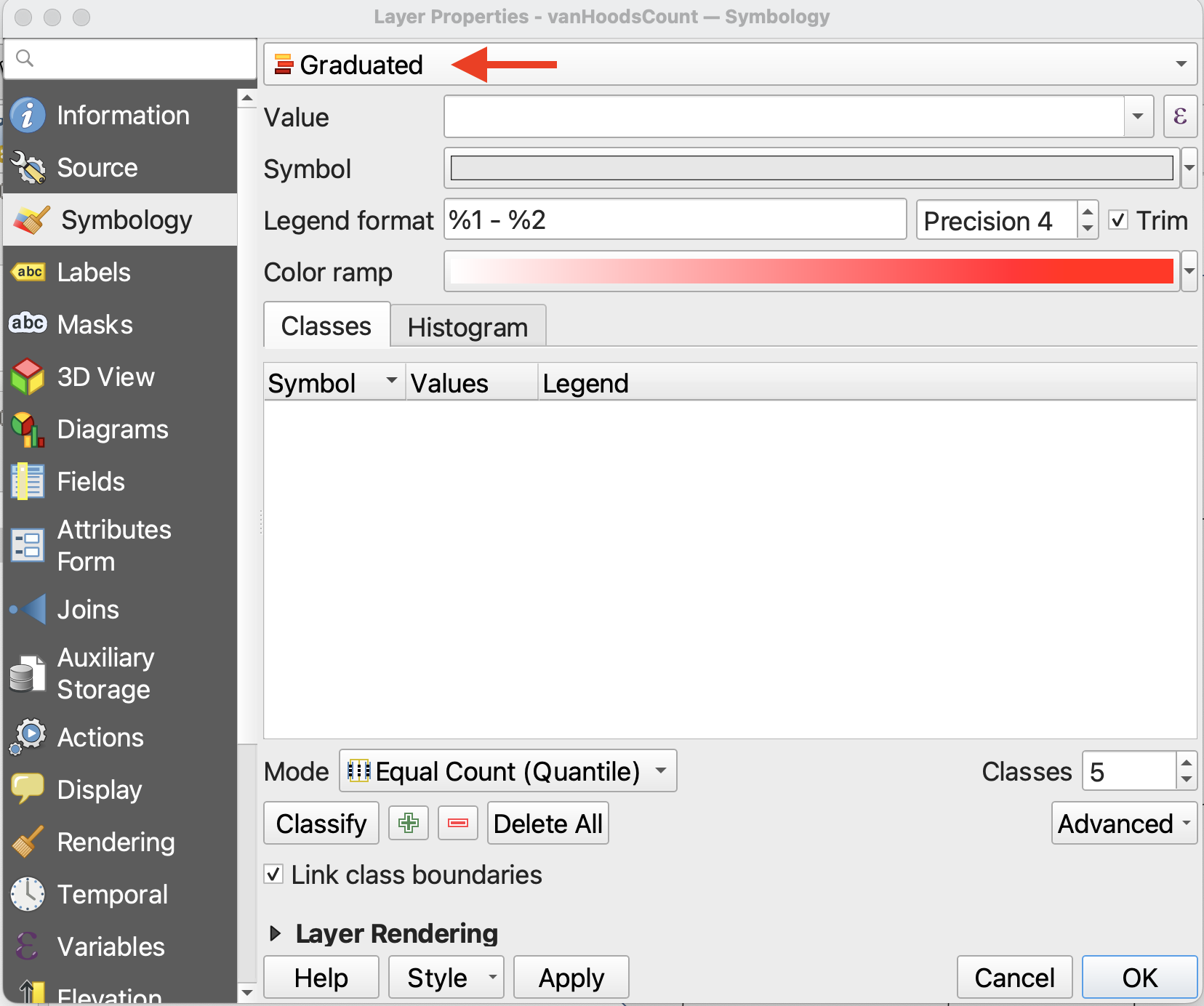
3 Set the Value to DougFirs. (Or Count, if you didn’t specify the attribute back when you ran the Count Points in Polygon tool.) This tells QGIS which numerical field to visualize.
4 Precision refers to how many decimals you want to include, and checking the Trim box removes trailing zeros from the legend. Because we are dealing with whole numbers of trees, so long as Trim is checked it doesn’t matter the precision.
5 You can select a color ramp from the given options, or design your own. Hover over “All Color Ramps” to see all options. For now, change the color ramp to greens. 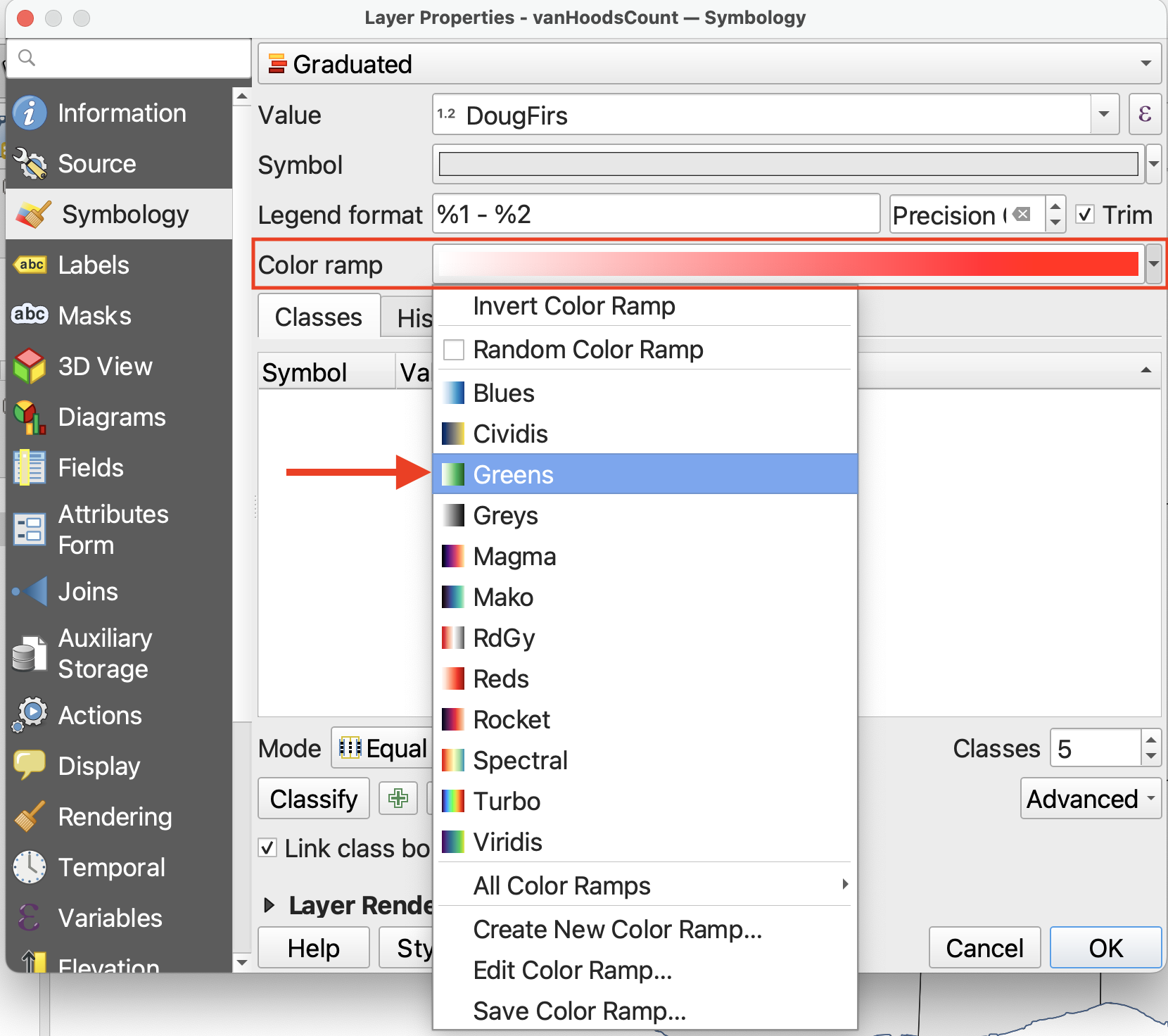
6 So far, we’ve set up the symbology but we have to apply it to our values. Click Classify to classify the DougFirs values. (If nothing shows up, check the attribute table of vanHoodsCount to ensure DougFirs is a numerical field.)
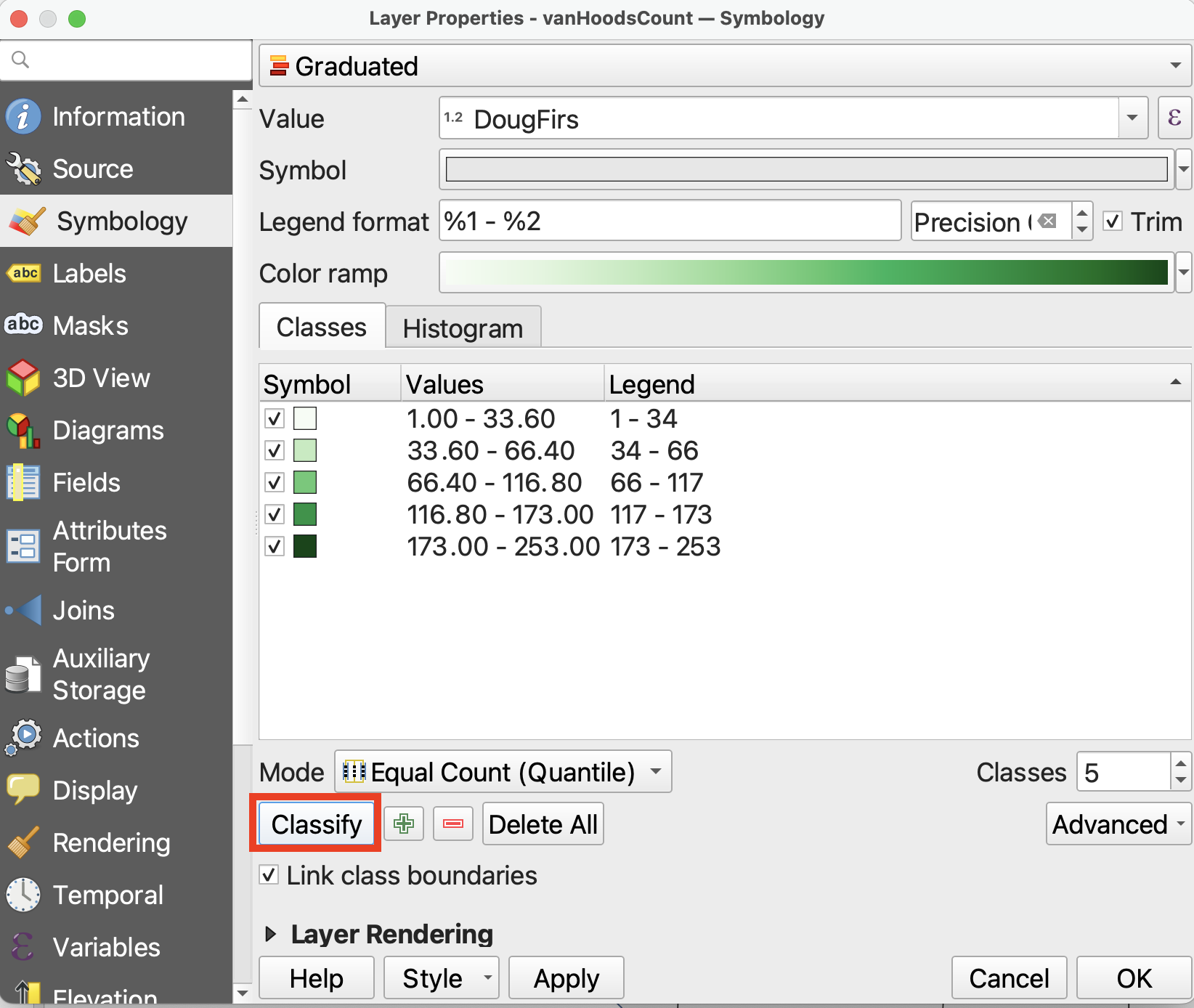
Then, click Apply to see your map change. Only after clicking Classify and then Apply will you see the results.
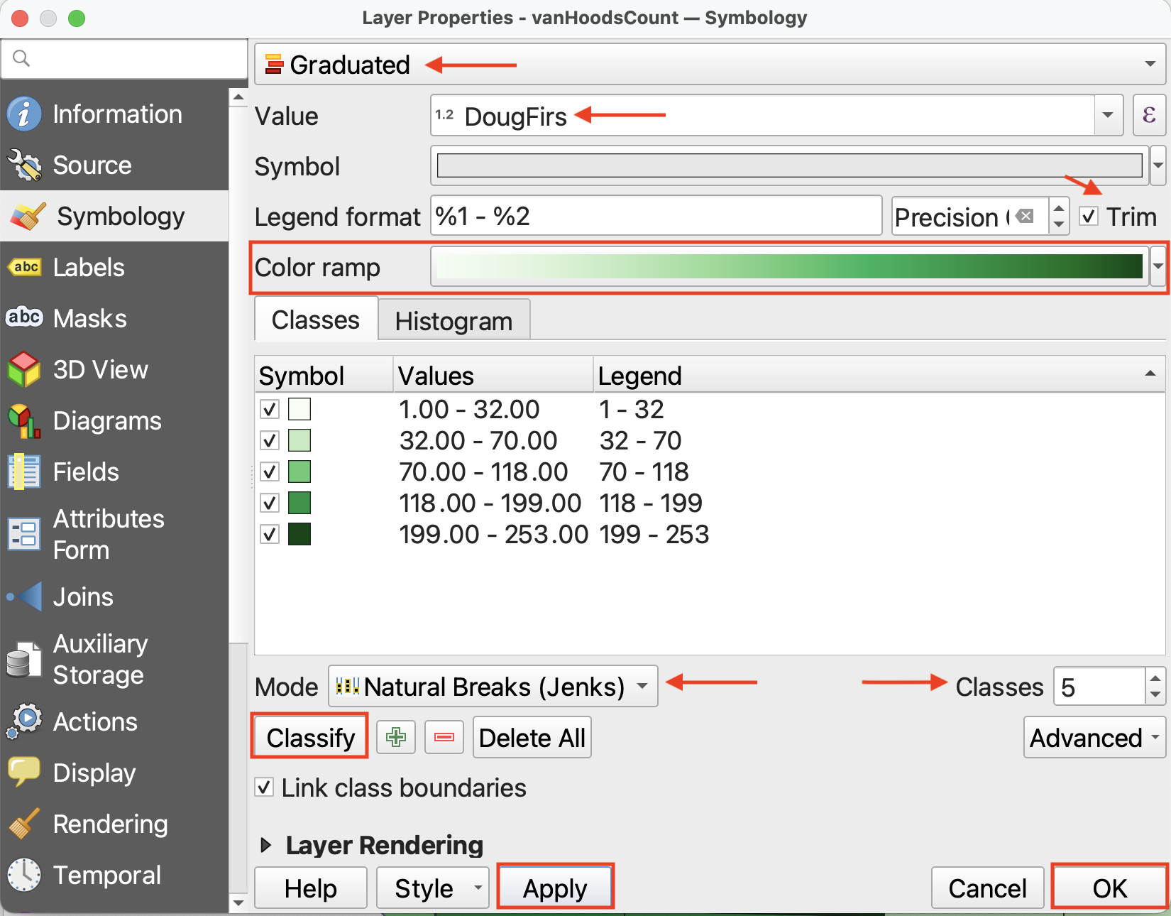
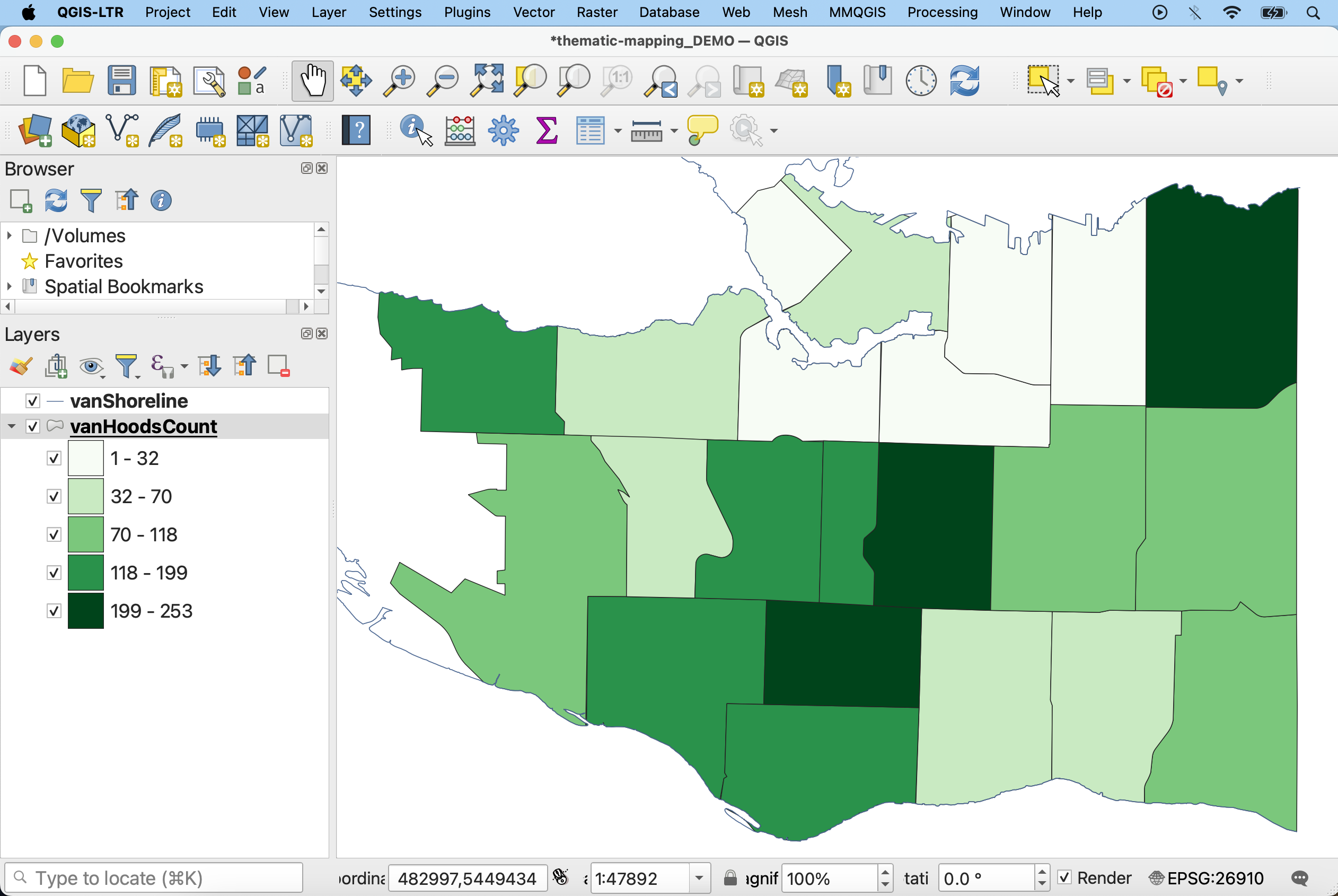
7 While the default classification mode is set to Equal Count (Quantile), you can choose amongst different classification modes. Classification modes determine how the distribution of data are grouped or “classified”, and therefore which values are associated with which colors. Read more about different classification modes here.
- Change the classification Mode to Natural Breaks (Jenks).
- You can also increase or decrease the number of classes, though between 5 and 7 is best practice. For today, keep the number of Classes set to 5.
- If you toggle to the Histogram tab, you can click Load Values to see the distribution of
DougFirsvalues. The X-axis indicates number of chestnut trees whereas the Y-axis, “Count”, refers to the number of neighborhoods with this number of chestnut trees. The number of bins refers to how granularly the number line is broken down.
8 Click Apply again and drag/resize your symbology window so you can see your map canvas. When you are satisfied, click OK and close the Layer Properties/Symbology window.
Loading last updated date...