2.3 Visualizing Tabular Data
Questions we’ll cover
- How can I visualize tabular data in Python?
- How can I group several plots together?
- How can I customize plots to make them more understandable?
Visualizing data
The mathematician Richard Hamming once said, “The purpose of computing is insight, not numbers,” and the best way to develop insight is often to visualize data. Visualization deserves an entire lecture of its own, but we can explore a few features of Python’s matplotlib library here. While there is no official plotting library, matplotlib is the de facto standard. First, we will import the pyplot module from matplotlib and use two of its functions to create and display a heat map of our data:
import numpy
import matplotlib.pyplot

data = numpy.loadtxt(fname='exhibit-visits-01.csv', delimiter=',')
fig1, ax1 = matplotlib.pyplot.subplots()
ax1.imshow(data)
fig1.savefig("1_imshow.png")
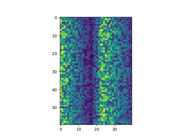
Each row in the heat map corresponds to a museum in the exhibit-visit dataset, and each column corresponds to a day in the dataset. Blue pixels in this heat map represent low values, while yellow pixels represent high values. As we can see, the general number of exhibit visits for the museums rises and falls over a 40-day period.
The line fig1, ax1 = matplotlib.pyplot.subplots() initiates a figure object (fig1) and an axis object (ax1) within the figure. Note that, despite the plural subplots in the command, you can use it to create one OR more subplots. Here, we’re just creating one.
The line ax1.imshow(data) takes the data and creates a heatmap in the axis.
The line fig1.savefig("1_imshow.png") stores the entire figure as a graphics file. This can be a convenient way to store your plots for use in other documents, web pages etc. The graphics format is automatically determined by Matplotlib from the file name ending we specify; here PNG from ‘1_imshow.png’. Matplotlib supports many different graphics formats, including SVG, PDF, and JPEG.
Now let’s take a look at the average exhibit visits over time:
ave_visits = numpy.mean(data, axis=0)
fig2, ax2 = matplotlib.pyplot.subplots()
ax2.plot(ave_visits)
fig2.savefig("2_lineplot.png")

Here, we have put the average exhibit visits per day across all museums in the variable ave_visits, then asked matplotlib.pyplot to create and display a line graph of those values. The result is a reasonably clear fall, rise, and fall again, in line with Maverick’s claim that the advertising campaign brought the visit numbers back up.
Grouping plots
You can group similar plots in a single figure using subplots.
Once a subplot is created, the axes can be titled using the set_xlabel() command (or set_ylabel()). Here are our three plots side by side:
fig3, axs3 = matplotlib.pyplot.subplots(1, 3, figsize=(10,3))

axs3[0].set_ylabel("average")
axs3[0].plot(numpy.mean(data, axis=0))

axs3[1].set_ylabel("max")
axs3[1].plot(numpy.amax(data, axis=0))

axs3[2].set_ylabel("min")
axs3[2].plot(numpy.amin(data, axis=0))

fig3.tight_layout()

fig3.savefig("3_subplots.png")
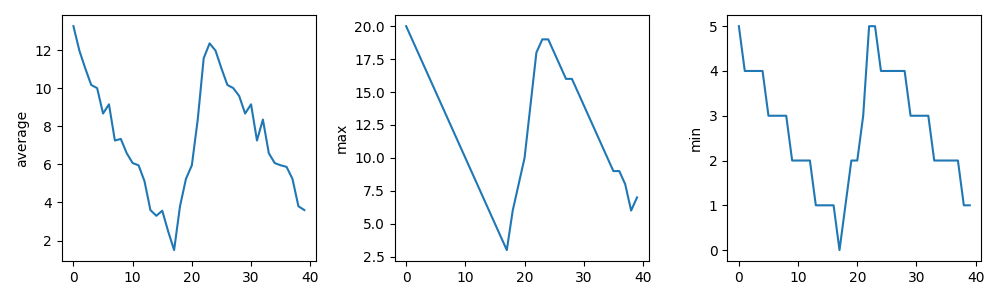
The line fig3, axs3 = matplotlib.pyplot.subplots(1, 3, figsize=(10, 4)) creates a figure object (fig3) with an axes object (axs3). I say axes (plural) because it is an array with 3 sets of axes in it; the first two parameters, 1 and 3 indicated that we wanted one row and three columns of subplots.
We add more to each set of axes by refering to its place in the array of axes-sets (e.g., axs[0]). The line axs3[0].set_ylabel("average") adds a label to the y-axis of the first subplot. The line axs3[0].plot(numpy.mean(data, axis=0)) adds a line graph inside the first subplot.`
After adding everything we want to the plot, we run fig3.tight_layout() to space out the graphs so that their y-axis labels don’t overlap.
Side note: Importing libraries with shortcuts
In this lesson we use the import matplotlib.pyplot syntax to import the pyplot module of matplotlib. However, shortcuts such as import matplotlib.pyplot as plt are frequently used. Importing pyplot this way means that after the initial import, rather than writing matplotlib.pyplot.plot(...), you can now write plt.plot(...). Another common convention is to use the shortcut import numpy as np when importing the NumPy library. We then can write np.loadtxt(...) instead of numpy.loadtxt(...), for example.
Some people prefer these shortcuts as it is quicker to type and results in shorter lines of code - especially for libraries with long names! You will frequently see Python code online using a pyplot function with plt, or a NumPy function with np, and it’s because they’ve used this shortcut. It makes no difference which approach you choose to take, but you must be consistent as if you use import matplotlib.pyplot as plt then matplotlib.pyplot.plot(...) will not work, and you must use plt.plot(...) instead. Because of this, when working with other people it is important you agree on how libraries are imported.
Challenge: Plot Scaling
Why do all of our plots stop just short of the upper end of our graph?
Solution
Because matplotlib normally sets x and y axes limits to the min and max of our data (depending on data range)
If we want to change this, we can use the set_ylim(min, max) method of each ‘axes’, for example:
axs3[2].set_ylim(0, 21)
Update your plotting code to automatically set a more appropriate scale. (Hint: you can make use of the max and min methods to help.)
Solution
# One method
axs3[2].set_ylabel("min")
axs3[2].plot(numpy.amin(data, axis=0))
axs3[2].set_ylim(0, 21)
# A more automated approach
max_data = numpy.amax(data, axis=0)
y_max = numpy.amax(max_data) * 1.1

axs3[2].set_ylabel("min")
axs3[2].plot(numpy.amin(data, axis=0))
axs3[2].set_ylim(0, y_max)
Challenge: Make Your Own Plot
Create a plot showing the standard deviation (numpy.std) of the exhibit-visit data for each day across all museums.
Solution
fig4, ax4 = matplotlib.pyplot.subplots()
ax4.plot(numpy.std(data, axis=0))
fig4.savefig("content/fig/4_std-lineplot.png")
Challenge: Moving Plots Around
Modify the program to display the three plots on top of one another instead of side by side.
Solution
fig5, axs5 = matplotlib.pyplot.subplots(3, 1, figsize=(4,10))

axs5[0].set_ylabel("average")
axs5[0].plot(numpy.mean(data, axis=0))

axs5[1].set_ylabel("max")
axs5[1].plot(numpy.amax(data, axis=0))

axs5[2].set_ylabel("min")
axs5[2].plot(numpy.amin(data, axis=0))

fig5.tight_layout()
fig5.savefig("content/fig/2.3_5_vertical-subplots.png")
Key points
- Use the
pyplotmodule from thematplotliblibrary for creating simple visualizations.
Loading last updated date...