Answer to exercise at dictionaries:
Input
data = dict(
    year=[],
    temperature=[],
    carbon_emission=[]
)

current_line = 0
with open('year_temperature_carbon_emission.csv', 'r') as f:
    lines = f.readlines()
    for line in lines:
        # the if skips the header
        if current_line > 0:
            line = line.replace('\n', '')
            var = line.split(',')
            year = int(var[1])
            temp = float(var[2])
            carbon = float(var[3])
            data['year'].append(year)
            data['temperature'].append(year)
            data['carbon_emission'].append(carbon)
        current_line += 1
Scipy
- Hnull the emission of carbon dioxide does not influence the earth average temperature
scipy.stats.pearsonr
-
scipy.stats.pearsonr(x, y)
- Calculates a Pearson correlation coefficient and the p-value for testing non-correlation.
Input
from scipy import stats
correlation_score, p_value = stats.pearsonr(data['temperature'], data['carbon_emission'])
print(correlation_score)
print(p_value)
Output
>>> print(correlation_score)
0.9926756337139083
>>> print(p_value)
2.953863897607027e-51
Interpreting the results:
-
p-value <
2.95...27e-51so that means that there is statistically significant correlation between temperature and carbon emission -
How strong is the correlation cor =
0.9970832 -
cor varies from
-1to1positive values indicate that an increase in the x variable increases the y variable. In this case, a value closer to 1 means a strong positive correlation.
Interpretation varies by research field so results should be interpreted with caution
Pandas
Wow. The correlation test was super simple. Do I need all the read file procedures or are there libraries to help me on that?
pandas.read_csv
- Read a comma-separated values (csv) file into DataFrame.
Input
import pandas as pd
mydata = pd.read_csv("year_temperature_carbon_emission.csv", error_bad_lines=False)
stats.pearsonr(mydata['temperature'], mydata['carbon_emission'])
Output
(0.8970831946611595, 8.404266218015166e-21)
There are small changes in the reported correlation score and p-value. This is mostly due to how precisely we represent decimal values. Pandas is a powerful package and many smart people have put a lot of effort on it, so this new score is more accurate than the first one.
Matplot & Seaborn
Can we plot earth’s temperature and and carbon dioxide emission?
Input
import seaborn as sns
Input
plt.rcParams['figure.figsize'] = [20, 10]
plt.tick_params(axis='both', which='major', labelsize=15)
sns.lineplot(x="year", y="temperature", data=mydata)
Input
plt.rcParams['figure.figsize'] = [20, 10]
plt.tick_params(axis='both', which='major', labelsize=15)
sns.lineplot(x="year", y="carbon_emission", data=mydata)
Output will be similar to:
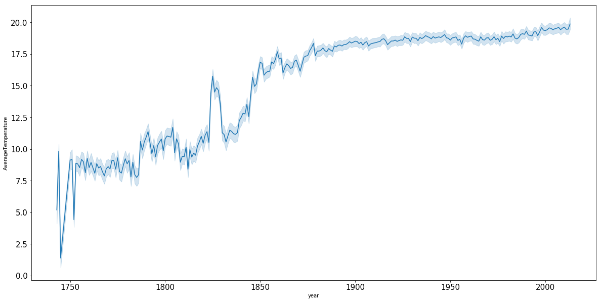
-
There are slight changes in the graph as the data from this figure was extracted from the intro-r workshop and it is more fine-grained.
-
The light blue represents the standard deviation on the average temperature for each year