Descriptive Statistics
Descriptive stat with basic summary function
Input
summary(mydata)
Descriptive statistics with visualization
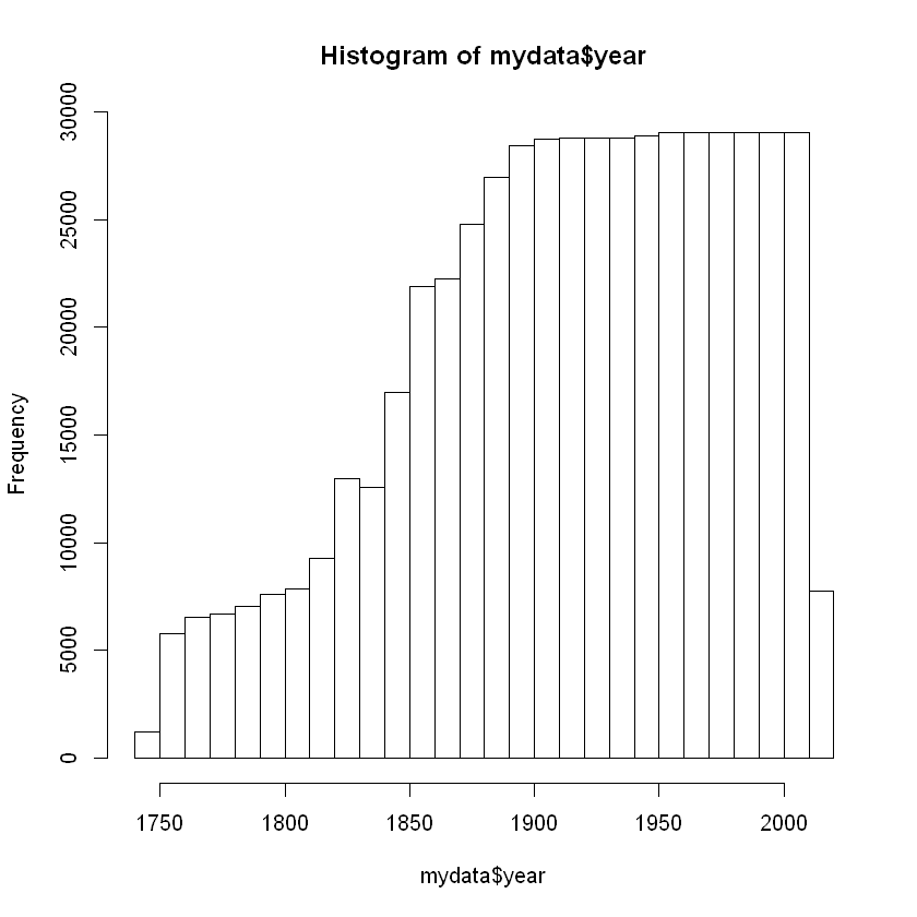
Creating histogram for “year”
Input
hist(mydata$year)
Creating a histogram using gpplot 2
Input
g <- ggplot(mydata, aes(x=year))
g <- g + geom_histogram(binwidth=.9) + scale_y_continuous(trans='log2')
g <- g + theme_light()
g <- g + labs(x="years", y="Frequency", face="bold")
g
ggplot(mydata, aes(x=year))creates a plot usingmydataaes defines thex,yand many other axisgeom_histogramdefines de plot as a histogram,binwidthdefines de width of the barsscale_y_continuous(trans='log2')transforms the scale of the graph tolog2delete+ scale_y_continuous(trans='log2')and check what happenstheme_light()changes the theme. There are various themes like black and white or color blind.labs(x="years", y="Frequency", face="bold")changes thexandylabels in the plot
Create barplot for “era”
Input
barplot(table(mydata$era))
More visualization functions with “ggplot2”
Try to run this command:
Input
ggplot(data=mydata, aes(x=year, y=AverageTemperature)) + geom_line()
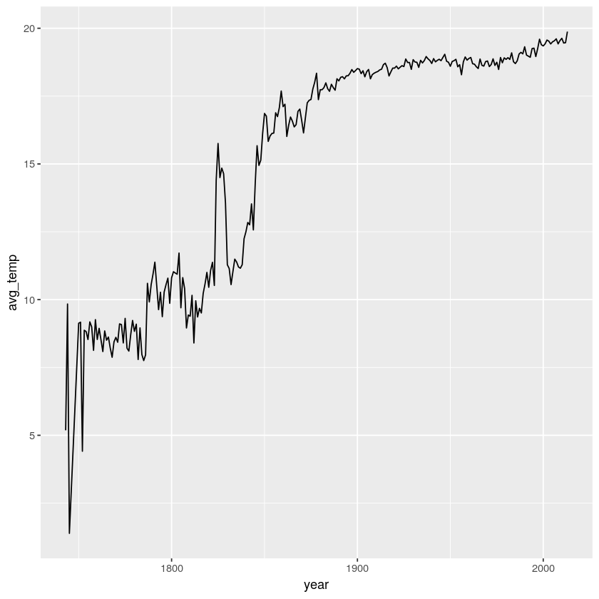
Can we do better?
What if we can manipulate the data so that we get the average temperature of each year?
group_by( ): Aggregates data based on the values from one or more columns
Input
grouped_data <- mydata  %>%
    group_by(year) %>%
    summarise(avg_temp = mean(AverageTemperature))
Input
head(grouped_data)
Plotting the grouped data
Input
ggplot(data=grouped_data, aes(x=year, y=avg_temp)) +
  geom_line()
If we are on track, try to:
1. load carbon dioxide data
2. remove NA
3. Change the column “CarbonDioxide” to numeric
4. Change the column “year” to numeric
5. view the data using the head( ) and tail( ) commands
6. get the mean CarbonDioxide emission of each year
Don’t spoil the fun. The stick figure is watching you