MAPPING DISTRIBUTION
In the previous section, we used choropleth mapping to visualize the distribution of one set of speakers provided in the dataset we’re using. Next we’ll use something called Dot Density, which is another way to represent quantities on a map.
1 Uncheck the layer we were working with in the last section and make visible the copy we made in the Contents pane.
2 From the Symbology pane on the far right (open it back up if it’s closed), select Dot Density from the dropdown menu under Primary symbology.
3 Select the Basic Random colour scheme.
Let’s create a few different layers using this symbology for the languages we identified as having larger numbers of speakers. First let’s create a map showing the distribution of Cantonese and Mandarin mother tongue language speakers.
4 Select these languages from the dropdown arrows under Fields.
5 Select the Background symbol below Dot Value and change the symbology colour to black. Leave the default outline colour and click Apply.
6 Highlight the popMotherTongTractVan copy layer in the Contents pane and reduce the Dot Size to 1.3 pt.
7 Change the colour of the dots if need be to make sure they’re visible. It should look something like the image below.
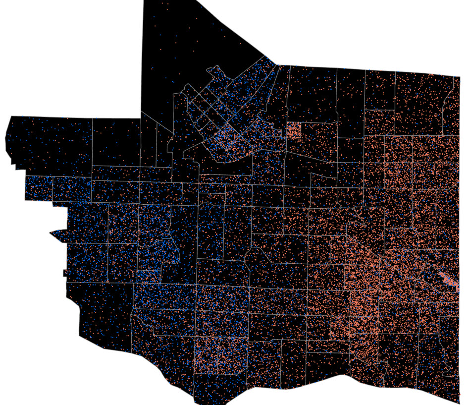
There’s a pretty interesting pattern that appears, which is that speakers of these languages are distinctly spatially clustered, with mother tongue Mandarin speakers in the western part of the city and mother tongue Cantonese speakers largely in the eastern part. Why do think that might be? Migration and settlement patterns where people follow relatives or neighbours from the old country to settle in the same geographic areas of the city? Household income? Any other ideas?
Mapping Additional Languages
1 Create a copy of this layer in the Contents pane by right-clicking and selecting Copy and then right-clicking Map and selecting Paste and save your map.
2 Rename the layer we used to create a choropleth map of Aboriginal Languages by right-clicking the layer, selecting Properties, and renaming it under the General tab in the new window that pops up.
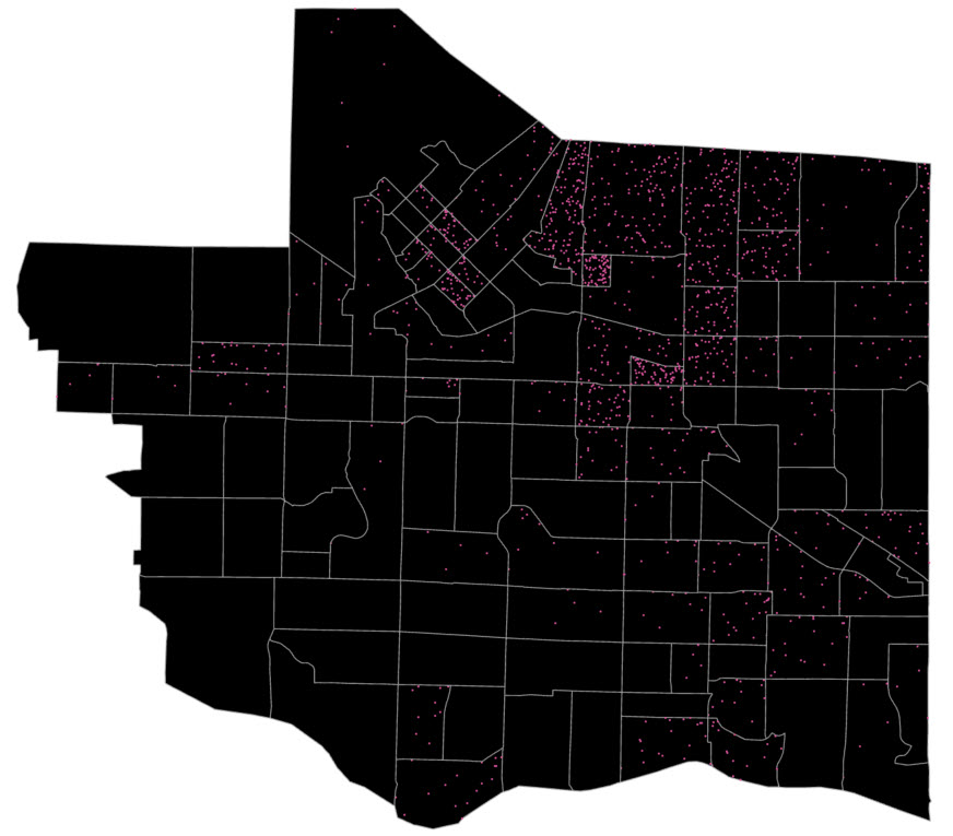
3 Rename the layer we just symbolized with dot density to Mandarin and Cantonese Languages and the newly copied layer to Panjabi Languages.
4 Ensure the only layer turned on is the Panjabi Languages.
5 Make sure this layer is using dot density symbology and that Panjabi is selected under the Fields.
6 Reduce the dot size again and choose an appropriate colour and make sure the Background symbology is black.
You can see that there is also a distinct geographic distribution of Panjabi mother tongue language speakers.
You also may have noticed by now that dot density symbology is more effective for this dataset compared to choropleth symbology. You may want to create a copy of the Aboriginal Languages layer and compare the choropleth and dot density symbologies for this dataset.
Exercise On Your Own
1 Create an additional one or two copies of the language data and, using dot density symbology, create one or two examples of the distribution of language speakers for a language of your choice. You can also compare two or more languages in the same map.
2 Label these layers accordingly in the Contents pane.
We’ll use one of these examples to create a map for export in the next section.