Symbology
1 Change the Basemap back to Light Gray Canvas and save your map.
Because we are going to symbolize the language data in a couple different ways, make a copy of the popMotherTongTractVan layer.
2 Right-click the layer in the Contents pane and select Copy.
Note that this only creates a copy in the map but does not create a separate feature class in the geodatabase where the data is stored. So the copy is for visualization purposes only.
3 Right-click the original layer in the Contents pane and select Symbology to reopen the symbology properties.
4 Click on the dropdown arrow under the Symbology option and select Graduated Colors.
Graduated color symbology is used to show a quantitative difference between mapped features by varying the colour of symbols.
5 Select Aboriginal Languages for the Field.
6 Clear the previously selected data by clicking on Clear under the Map tab > Selection pane.
You can see that the darker colours are associated with the Census tracts with higher speaker numbers we identified in the last section, so we might instinctually feel this symbology offers a good representation.
This is what is called choropleth mapping, and while it is very useful and a popular method for thematic mapping, it is also a method that can easily and inadvertently be used to misrepresent data.
One of the rules of choropleth mapping is never to symbolize raw data, or absolute numbers. Instead we should use rates, ratios, or percentages. This is called data normalization. In our case that means we need to transform the number of speakers into a proportional variable, such as number of speakers of a language divided by the total number of people per Census tract.
ArcGIS Pro has a built-in function to normalize your data when you’re using graduated colours (choropleth mapping).
7 Under the Normalization field, select percentage of total from the very top and note what the symbology looks like now.
Using this option means that Pro is totalling all of the values for each Census Tract and using this to divide the number of speakers by this total value. The problem is that the total number of speakers of all of these languages does not add up to the total number of people in each Census Tract, because this dataset excludes English and French mother tongue speakers. This is why we joined a dataset containing total population of Census tract. Either ratio is legitimate, but we have to make sure we know which is which. It may be worth asking whether dividing by population over the age of 5 per Census tract would be even more appropriate.
Data Classification
1 Select Total Pop for the Normalization field and notice that the default classification method is Natural Breaks, which differentiates the data into “natural” breaks.
2 Click the Histogram tab below to see where these breaks are.
3 Alternately select the Quantile and Equal Interval classification methods to see what this does to the appearance of the map.
Data classification can be tricky to understand, and sometimes it is difficult to make a decision about the best method. A good way to identify the most suitable method is to think about what questions about the data you want to ask and reveal. For example, if we want to create a map showing the Census tracts with the highest number of speakers, we might choose Equal Interval. But if we are interested in the overall distribution of Aboriginal Language speakers across all Census tracts, we might choose Natural Breaks or Quantile, the latter which distributes a set of values into groups that contain an equal number of values.
If you examine some of the polygons attributed with the first classification break using Natural Breaks, however, you may see that it includes Census tracts with four speakers for example (you can use the Select tool to click on a polygon and then on Attributes from the Selection pane to view the number of Aboriginal Language speakers represented for each Census tract). Because the numbers of speakers are so low across many Census tracts, we want to make sure we include a classification method that makes even these visible.
4 Now select Geometric Interval as the method, which is good at highlighting values in the middle as well as extreme values. It is a good option to use when a dataset, like ours, has a lot of zero values.
5 Click on the Advanced symbology options from the Symbology pane and select Percentage under Category, which is easier to understand than rate.
We’ll leave the default number of classes (5) and the colour scheme. Because it’s misleading to have zero value polygons symbolized with a colour, let’s remove the colour for the first classification category.
5 Click on the Symbol polygon in the first row under the Classes tab and select No color from the Color dropdown and click Apply. It may make the map look a little funny, but it’s more honest.
6 Select the Dark Gray basemap or uncheck the basemap layers in the Contents pane and save your map.
Your map should look something like this: 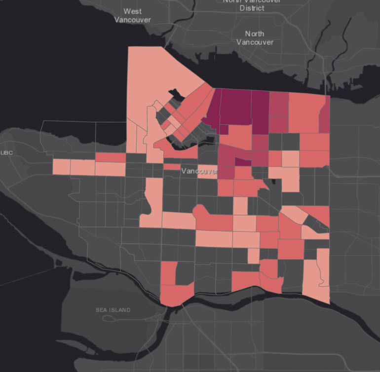
In the next section, we’ll use a different symbology to explore other languages.