Formatting
Exploring the Marks card
Dragging Country/Region to the Color section of the Marks card added new information to the graph, encoded as colour. The Marks card also allows you to adjust other formatting.
On a sheet with more than one measure the Marks card settings can apply to the entire sheet or just to one measure. Notice how the Marks card in our line graph has several sections: All, SUM(Cases) (with a triangle indicating a calculated field), and SUM(Cases). Clicking each of these reveals a separate Marks card with independent settings.

Exercise 4: experiment with with formatting options
Take a few minutes to explore and play with the options in the Marks card. There’s no “right” answer here, just an opportunity to try things out and ask questions. If you’re not sure where to start here are some things to try:
- Change the thickness (size) of the lines to make them easier to read.
- Change the “opacity” of the lines so it’s easier to see areas where the lines overlap.
- Adjust the graphs so one has a single line showing the total for all selected countries, while the other has a coloured line for each country
- Reformat a tooltip to make it easier to read and interpret
- Add Deaths to the tooltips, with a table calculation where appropriate
Optional: add a map
Formatting options relevant to one graph type may not be suitable for another. Create a map to explore other ways of representing the data.
1 Create a map based on Cases
- Add a new sheet and label it Map
- Double-click Country/Region
- Drag Cases onto the Size section of the Marks card
- Drag Country/Region onto the Color section of the Marks card
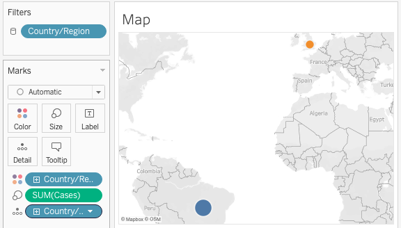
Once again, play with the Marks card settings to see what happens. (Don’t be afraid to experiment, you can always Undo.)
Loading last updated date...