Calculations: part 2
In this section we’ll create a line graph showing cases over time, introducing several Tableau features along the way:
- Table calculations
- Using the Marks card with dimensions/measures
1 Create a line graph of Cases
The foundation for this section is a line graph with each day represented on the horizontal axis. Start by adding a new sheet and renaming it Line.
- Double click the Cases measure to add it to the chart
- Double-click Date to add it to Columns shelf
- Right-click Date on the Columns shelf and select the second Day format
The result is a simple line graph showing total cases for each day.
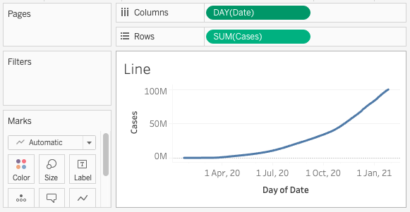
Table calculations
A table calculation is similar to a calculated field but it does not create a new measure/dimension and only applies to the current sheet.
2 Add a table calculation to show new cases per day
- Right-click the
SUM(Cases)measure on the columns shelf and select Add Table Calculation - Review the settings in the pop-up window. To show new cases per day:
- Calculation Type: Difference From
- Compute Using: Table (across)
- Relative to: Previous

The Quick Table Calculation menu option is a shortcut to generate a table calculation with default settings. If you need to edit a calculation’s settings, use the right-click menu option to Edit Table Calculation.
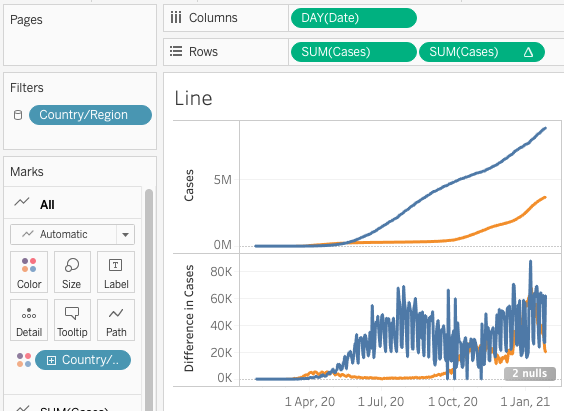
Exercise 3: a graph with two measures
The new line graph shows the number of new cases each day. What if you want to display both line graphs at the same time: one for the total number of cases, and the second for the new cases?
Click for hints
The same measure can be added to a display more than once, with different calculations and formatting options applied to it each time.
Adding Country/Region information
So far our graphs show information for all countries combined. With the Marks cards we can add new elements to the graph and format them.
3 Represent each Country/Region as a coloured line
- Drag the Country/Region dimension onto the Colors section of the Marks card.
- Tableau may warn you that this action will add more than the recommended number of items to this shelf; click the Filter and then add option
- Select the countries you wish to display, then click OK
This example shows Brazil and the United Kingdom
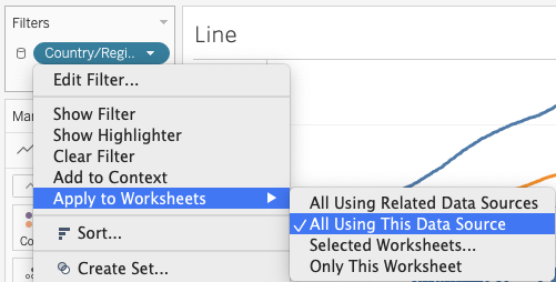
Filter settings: continuity across sheets
We now have a table with summary information on one sheet, and a second sheet with a line graph showing change over time. A filter controls which countries appear in the line graph.
In a dashboard we may want a filter to control multiple sheets at the same time. The range of a filter can be changed by right-clicking it on the Filters card and using the Apply to Worksheets sub-menu.
Loading last updated date...