Choropleth Symbology
As it is, we can’t glean any information regarding the spatial distribution of French Canadians in Historic Montreal by simply looking at fc-count. So, what we need to do is change the Layer Symbology to render visible the values in the percent-fc field. We can use either color or symbols to convey the range of total trees. Let’s begin by making a choropleth map, using a color gradient to visualize the percentage of the population that are French Canadian in each historic census tract.
Making a Choropleth Map
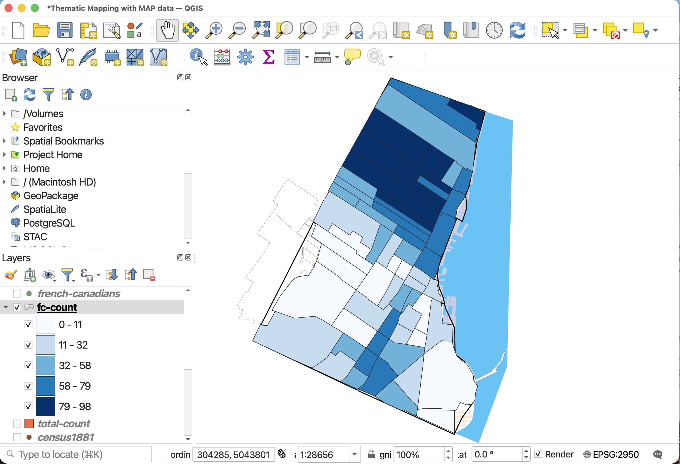
1 Remove or turn off all point layers. Turn off total-pop for now. Then, open the symbology for fc-count.
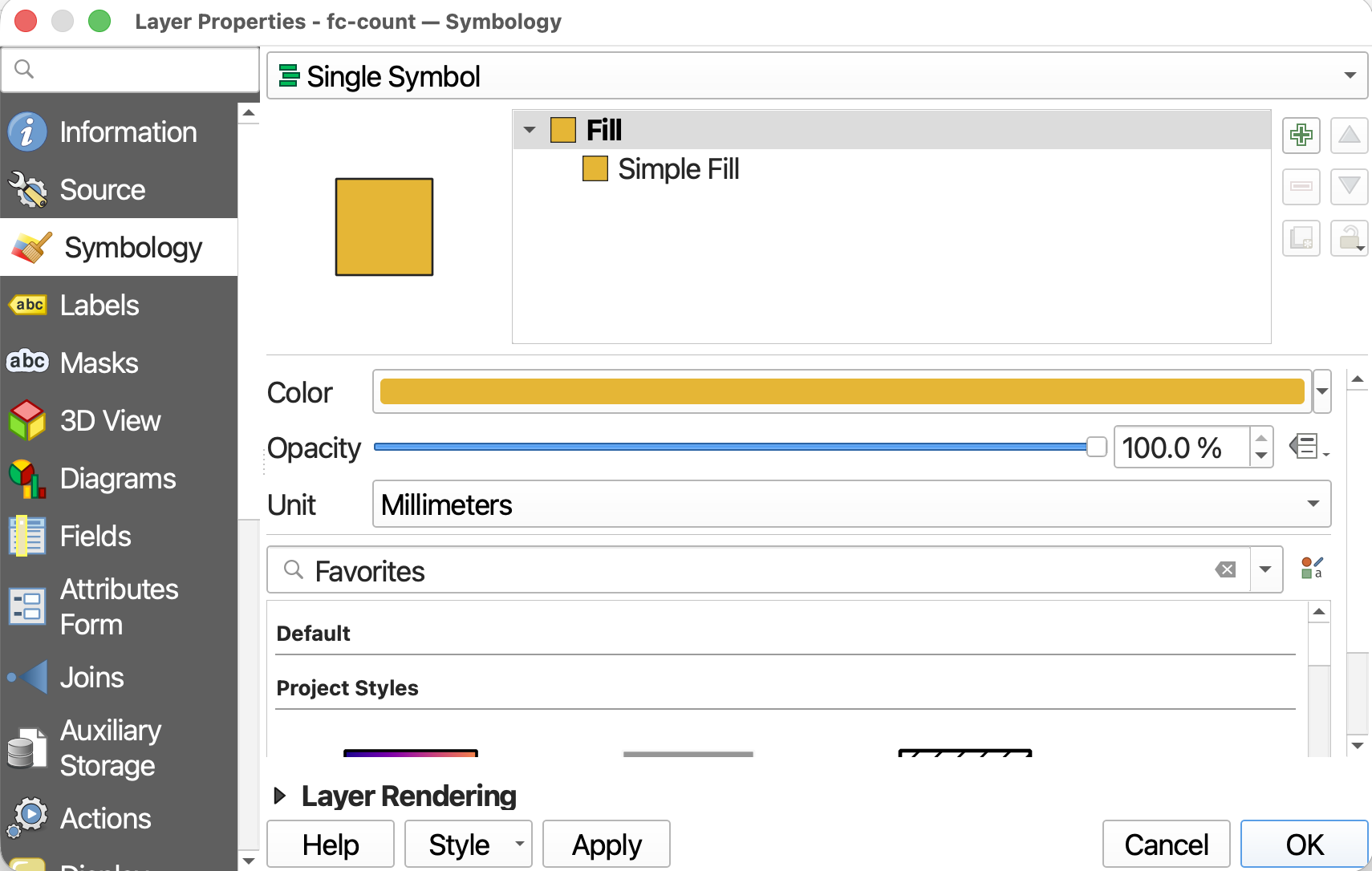
2 At the very top, we can see that the symbology is set to Single Symbol. This means every feature in the dataset is rendered in the same color. Since we want to show a range of values, we need to change the symbology. Click on Single Symbol and from the drop-down, choose Graduated. This will allow you to symbolize each neighbourhood along a gradient of color, with darker colors representing more trees and lighter colors representing fewer.
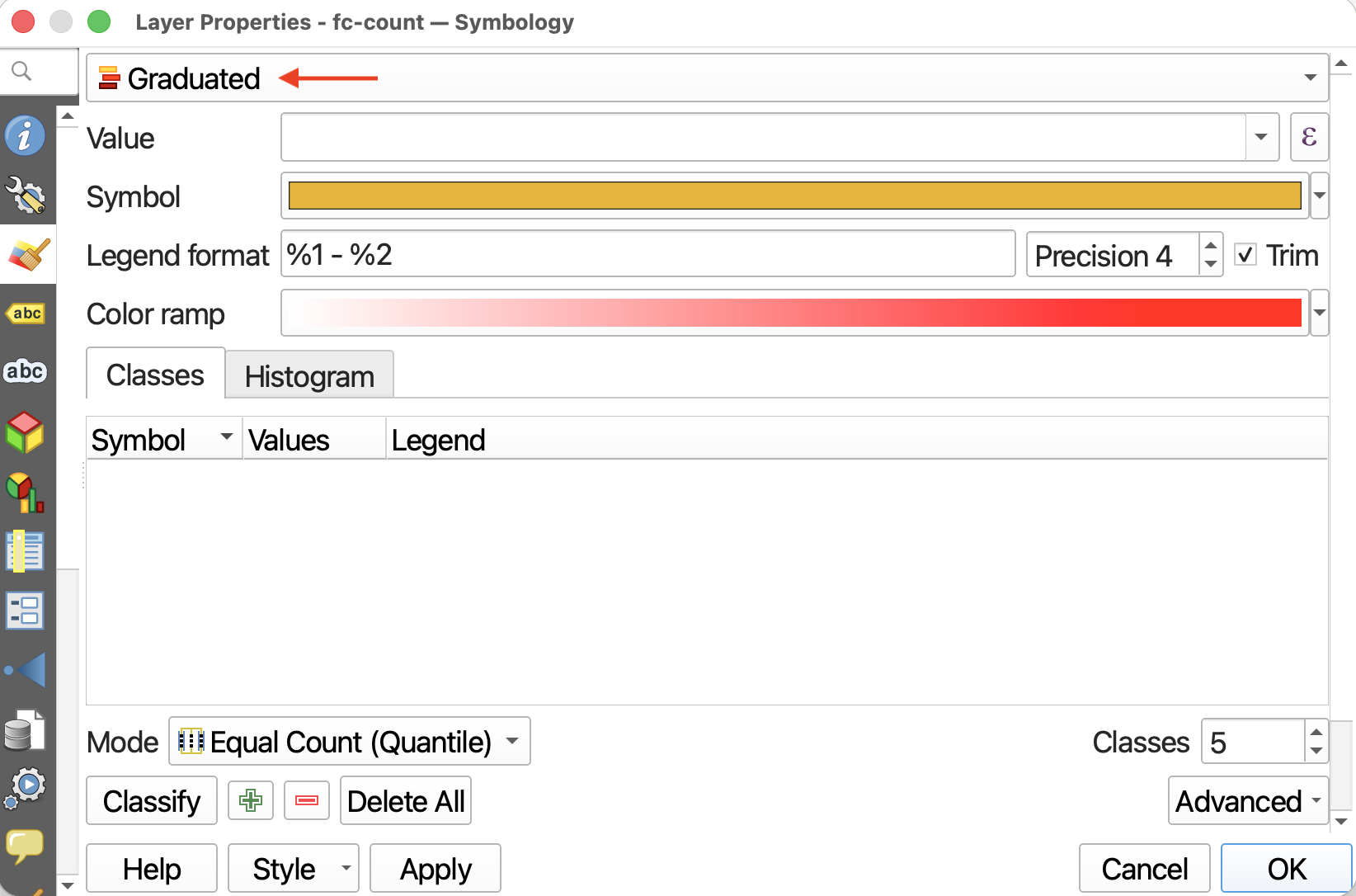
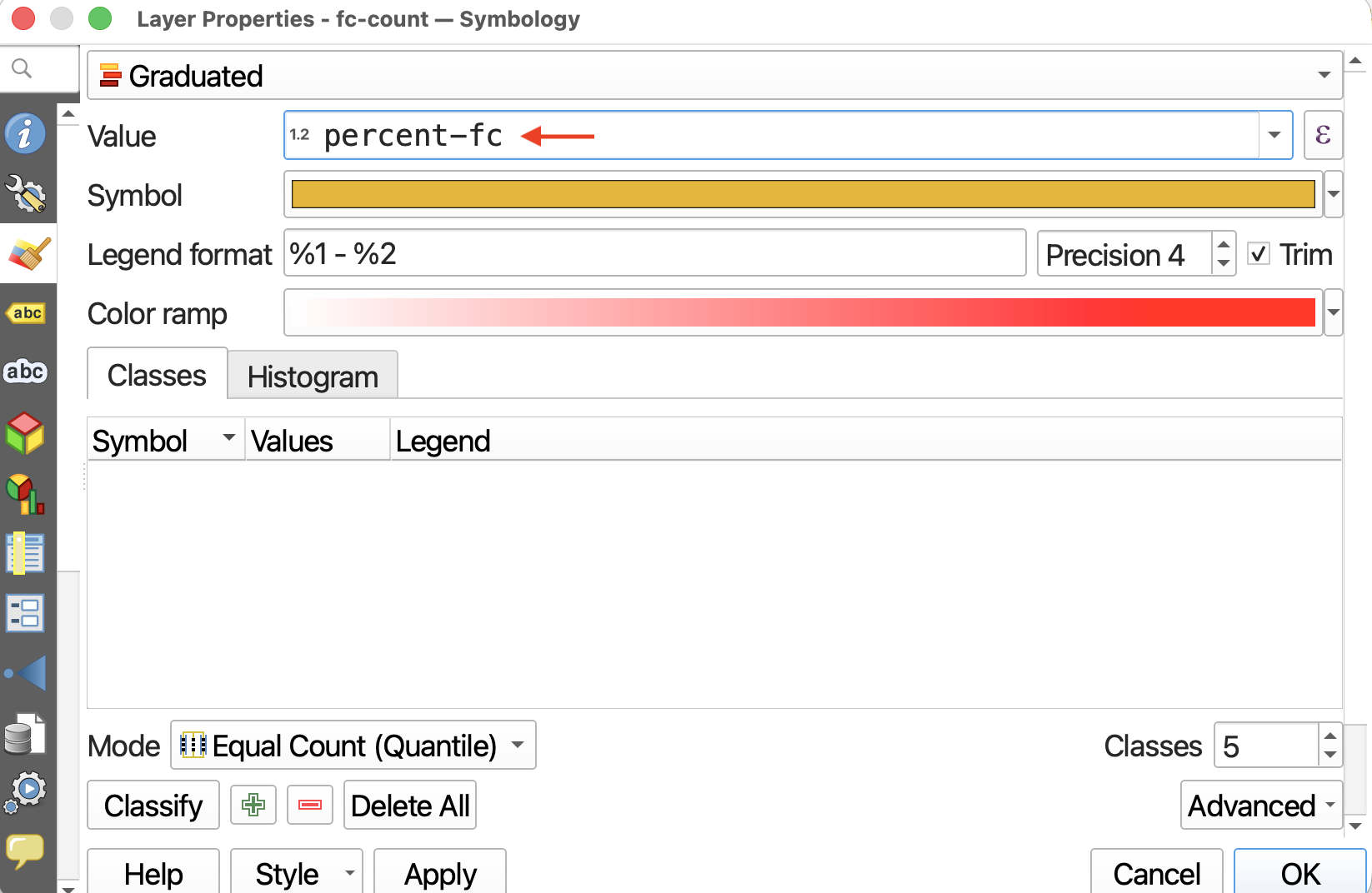
3 Set the Value to fc-percent. This tells QGIS which numerical field to visualize. (If nothing shows up, check the attribute table of fc-count to ensure percent-fc is a numerical field.)
Notice that you can choose any numerical field. You could make a choropleth map of total population.
4 Precision refers to how many decimals you want to include, and checking the Trim box removes trailing zeros from the legend. You can change the precision here to include fewer decimal places than the column originally has.
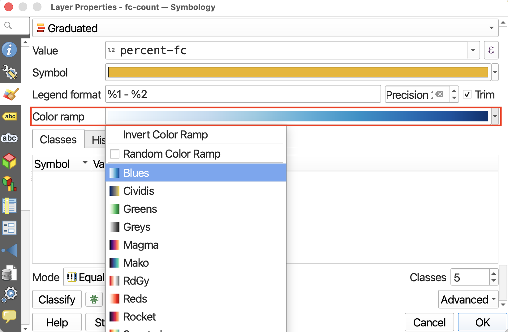
5 You can select a color ramp from the given options, or design your own. Hover over “All Color Ramps” to see all options. For now, change the color ramp to blues.
6 So far, we’ve set up the symbology but we have to apply it to our values. Click Classify to classify the percent-fc values.
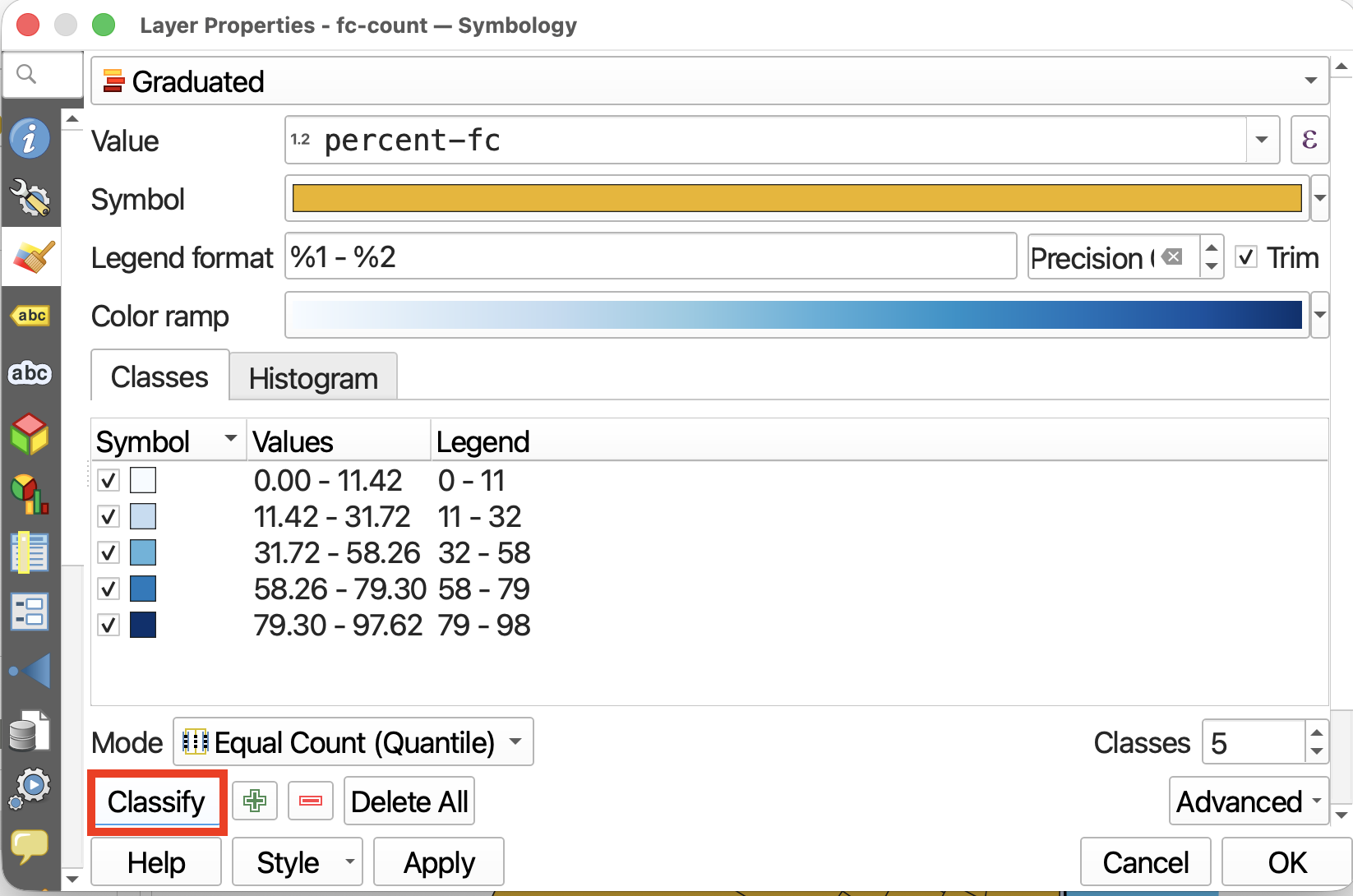
Then, click Apply to see your map change. Only after clicking Classify and then Apply will you see the results.
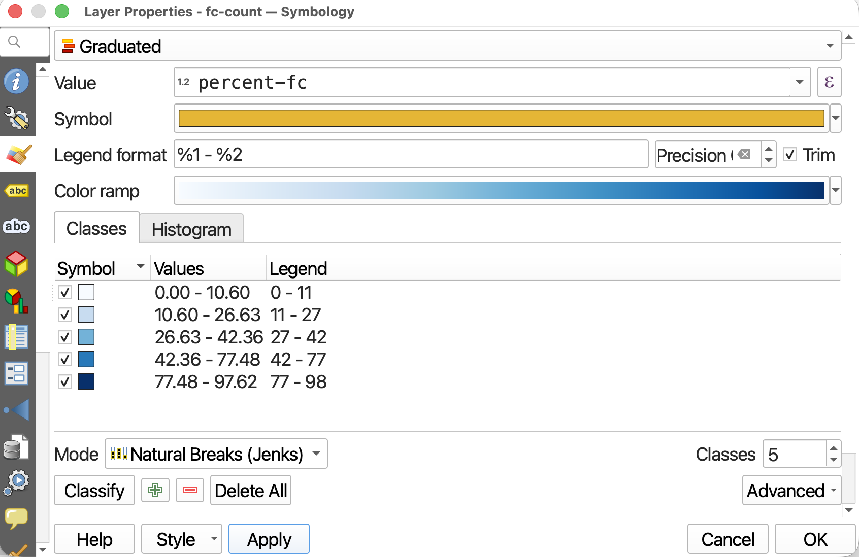
7 While the default classification mode is set to Equal Count (Quantile), you can choose amongst different classification modes. Classification modes determine how the distribution of data are grouped or “classified”, and therefore which values are associated with which colors. Read more about different classification modes here.
- Change the classification Mode to Natural Breaks (Jenks). Then hit Apply.
- You can also increase or decrease the number of classes, though between 5 and 7 is best practice. For today, keep the number of Classes set to 5.
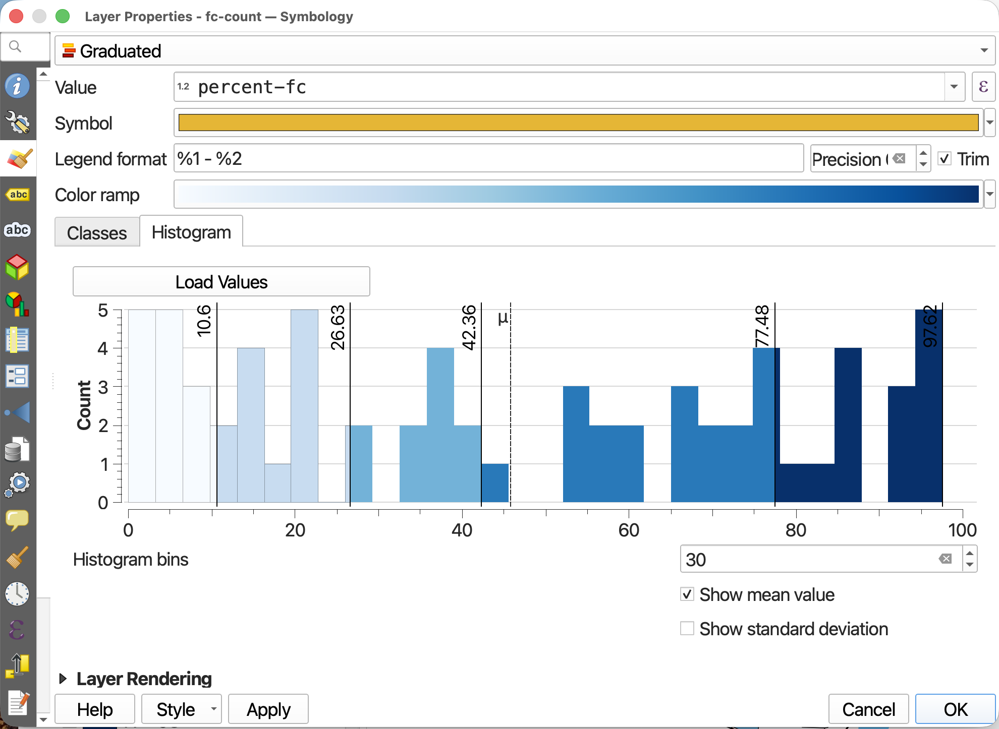
- If you toggle to the Histogram tab, you can click Load Values to see the distribution of
percent-fcvalues. The X-axis indicates percentage French Canadian population, whereas the Y-axis, “Count”, refers to the number of census tracts with this percentage French Canadians. The number of bins refers to how granularly the number line is broken down.
8 Click Apply again and drag/resize your symbology window so you can see your map canvas. When you are satisfied, click OK and close the Layer Properties/Symbology window.
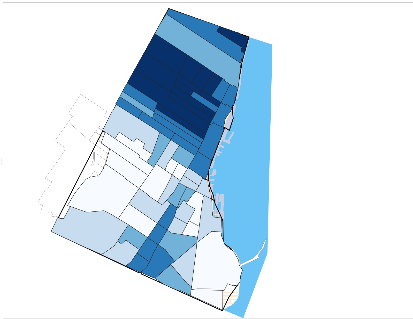
Congratulations! You’ve made a choropleth map!
Resources for Choropleth Mapping
Loading last updated date...