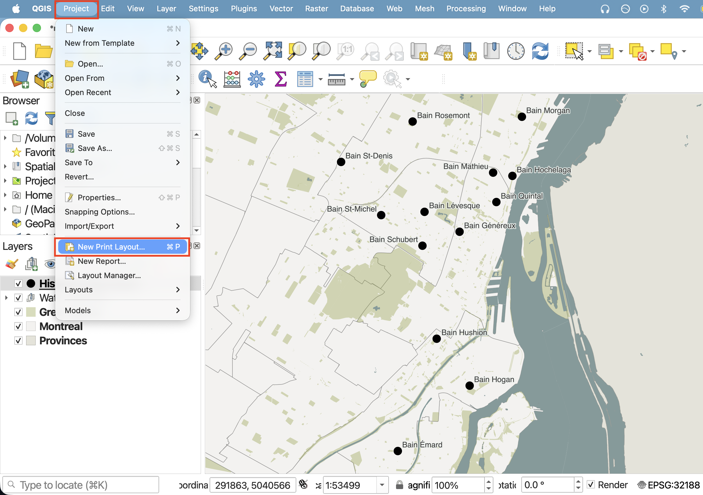
Create a map: Print Layout
Once you are satisfied with your layer symbology, it’s time to create a Print Layout. A Print Layout in QGIS is like a drawing board where you add the map you created, as well as other elements like a north arrow, legend, scale bar, text boxes, and other marginalia. You can create multiple Print Layouts per QGIS project. By giving each Print Layout a unique name and saving it (and your QGIS project) regularly, you can return to a Print Layout at any time (from the Project menu –> Layouts) and continue working.
See the QGIS User Guide here for a comprehensive introduction to the QGIS Print Layout.
On this page:
Create a new Print Layout
Create a new Print Layout by going the Project menu, and down to “New Print Layout”. Call it “Public Baths”.
Alternatively, you can click the Print Layout icon in the Toolbar. 
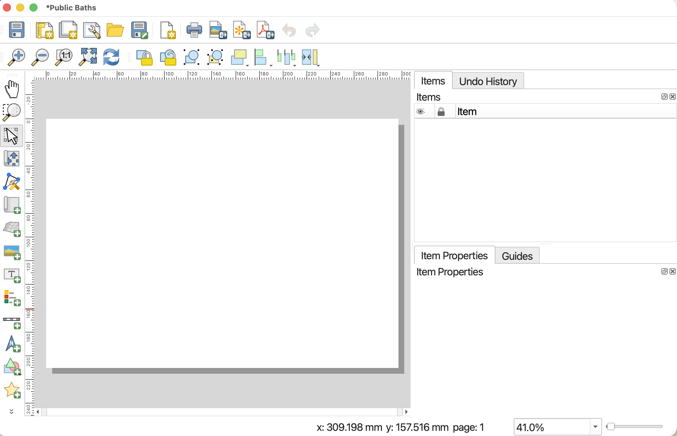
This will open the Print Layout window. It looks quite similar to the main QGIS interface, so be careful not to edit the wrong thing. Notice, too, that once you’ve clicked into the Print Layout window, the menu at the top of your screen changes.
Set Page properties
Page Properties govern the orientation and dimensions of the Print Layout, or page. Depending on your publication platform, you might already know your layout constraints. Journals or book publishers will give you max and min dimensions for figures, as well as often dictate what file form they want them in (.png, .pdf, or, often, an .svg or .ai file). For example, when making maps for books, the largest dimensions might be 4 x 6 inches. Note that JPEGs are discouraged in favor of PNGs as PNGs store information at a higher resolution.
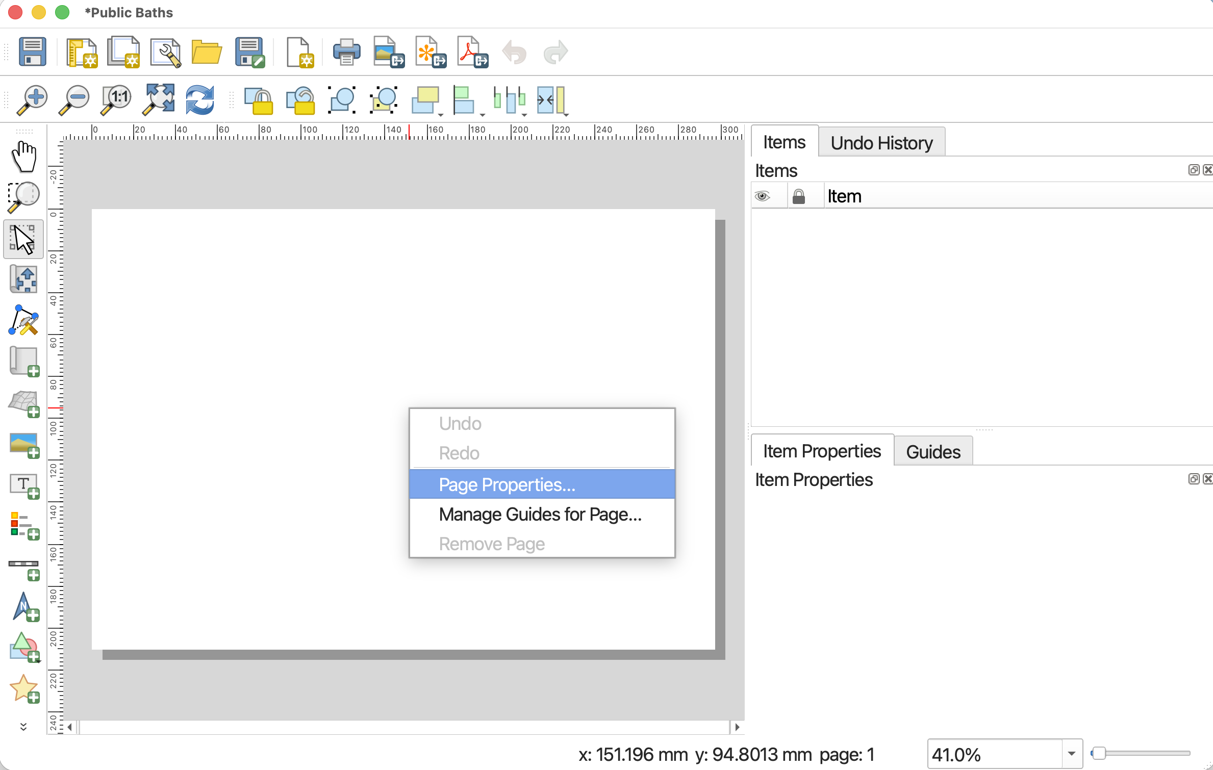
To change the dimensions of the page, go to “Page Properties…” by right-clicking anywhere on the page’s whitespace. You can also find Page Properties in the Layout menu at the top of your screen.
Let’s set the page dimensions for today’s map to be A4. And, let’s change the orientation to Portrait to better accommodate the extend of our data. To change the dimensions, click the Size drop-down options and select “A4”.
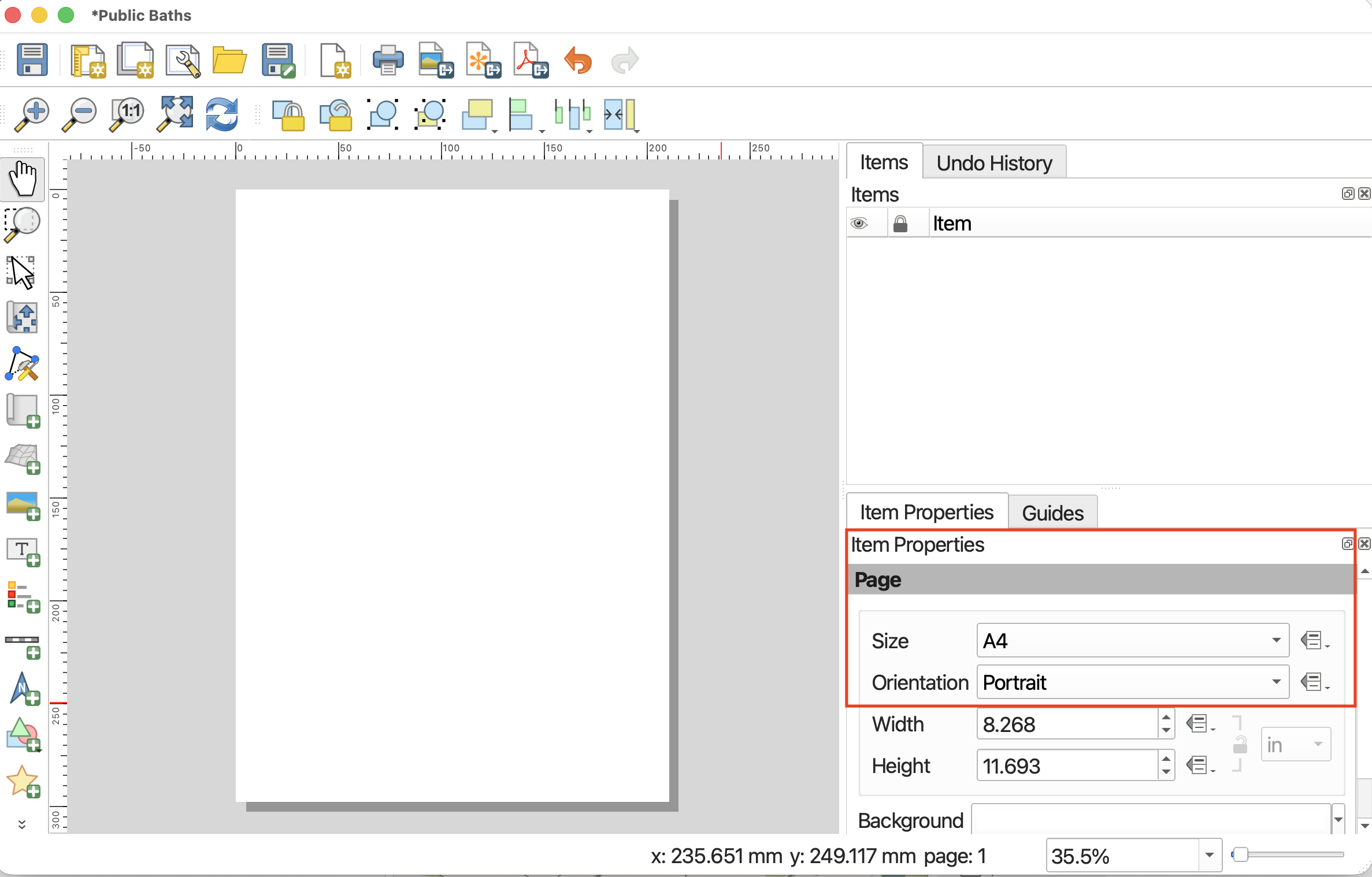
To set custom dimensions, choose “Custom” size at the very bottom of the drop-down. This will activate the Height and Width input boxes. If setting a custom size via Height and Width, remember to include the units for these dimensions. In this way, you can set very specific dimensions depending on the criteria of your publisher.
Note: If you set smaller dimensions than the default, your Print Layout—the white page juxtaposed to the grey background—will get smaller. To zoom it in so you can see your workspace, drag two fingers diagonally or scroll to enlarge the amount of space your Print Layout takes up on the screen. If you change the size of your Print Layout after you’ve already added a map, remember to adjust the map size; only what is contained within the Print Layout will be exported.
Add items to the Print Layout
At minimum, apart from the map itself, a Print Layout should have a title, scalebar, north arrow, and map author/data source. A legend is required if you have any layers added to your map that aren’t reference layers or that need explanation.
We can add items using the icons on the left-hand vertical toolbar, but I find these difficult to interpret. For this reason, I default to adding items from the Add Items menu.

Note: If you don’t see the Print Layout menu at the top of your screen, make sure you’ve clicked into Print Layout. If you click back into your main QGIS project, the menu at the top of your screen will change correspondingly.
Add the map
First things first, let’s add the map we made to our Print Layout. Click on “Add Map” from the Add Items menu. Your curser should turn into a crosshair when hovered over the page whitespace. Drag diagonally across your Print Layout page, corner to corner.
You might have to adjust symbol and text size accordingly in the Layer Properties of public-baths in the main QGIS interface. Once done, you can click the refresh icon in your Print Layout view and the print layout will update. Click save to save your work thus far. ![]()
Once you add an item to your Print Layout, it will also show up in your Items list. The Items list is similar to your Layers Panel, but for the Print Layout. Click on any item in your Items list to view and modify its properties.
See here for documentation on adding multiple maps to create insets.
Adjust the map in Print Layout
-
 To move your map around within the frame itself, use the Move item content tool from the left-hand toolbar.
 -
 To select, resize, or move content like the map itself, use the Move/Select item tool.
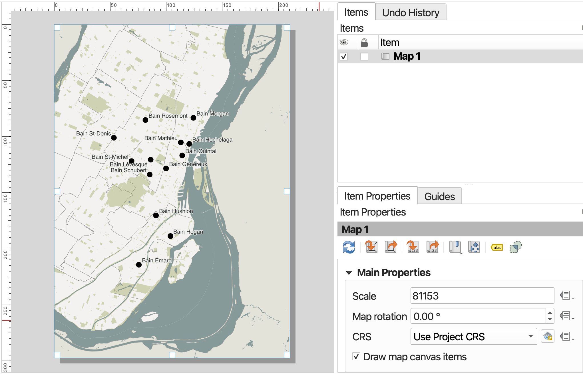
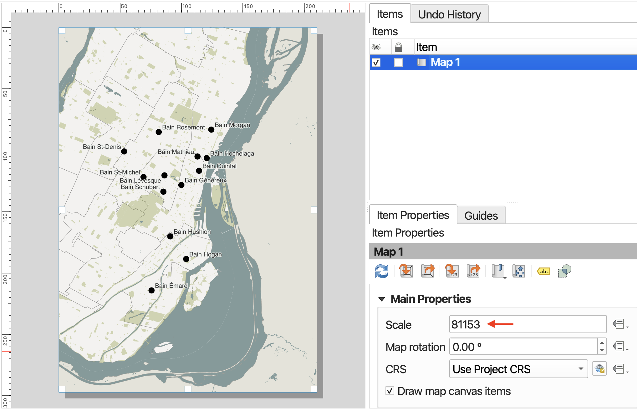
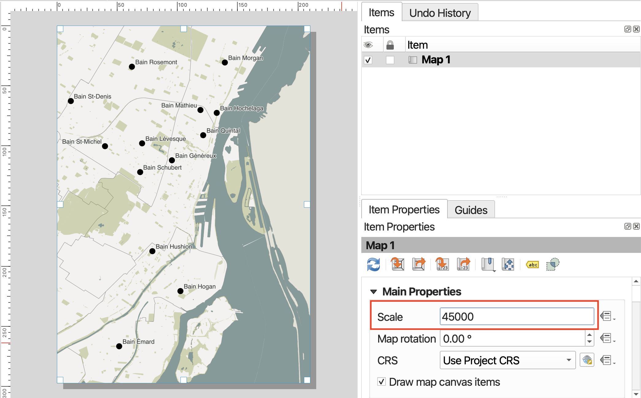
You’ll notice that Montréal might not take up the full page; in other words, it’s rather zoomed out. To zoom in, the most reliable method is simply to change its scale. We can do this from the Item Properties. You can activate an Item’s properties simply by clicking it in the Items list, and then looking at the Properties panel below it. Note: You’ll likely have to scroll to modify many of the properties, and resize your Items panel to reach the dropdowns.
The scale number, 81153 in the demo screen, is the denominator in a fraction 1:81153. This means 1 unit on the map represents 81,153units in the real world. To zoom in, we want to reduce the denominator so that the fraction is a larger number, and 1 unit on the map corresponds to a smaller, more localized area in the real world. When in doubt, simply increase or decrease the scale number substantially to gauge which direction you need to go in. For this map, something like 45,000 should work.
Add a scalebar
Now that we’ve set the scale of our map, let’s add a scalebar to the Print Layout. Just like above, you can add a scalebar from the Add Item menu at the top of your screen. (Remember, if you don’t see this menu bar, make sure you’re clicked into the Print Layout window.) Again, to add the scalebar item to your Print Layout, draw a small rectangle with your cursor.
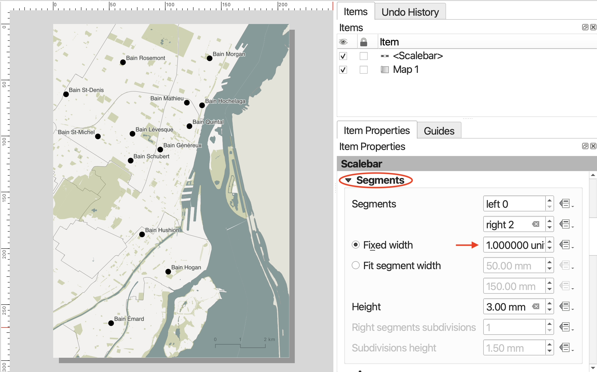
Once you’ve added the scalebar, you can customize it. Choose a scalebar Style from the dropdown menu. The scalebar will adjust automatically if you adjust the scale of your map.
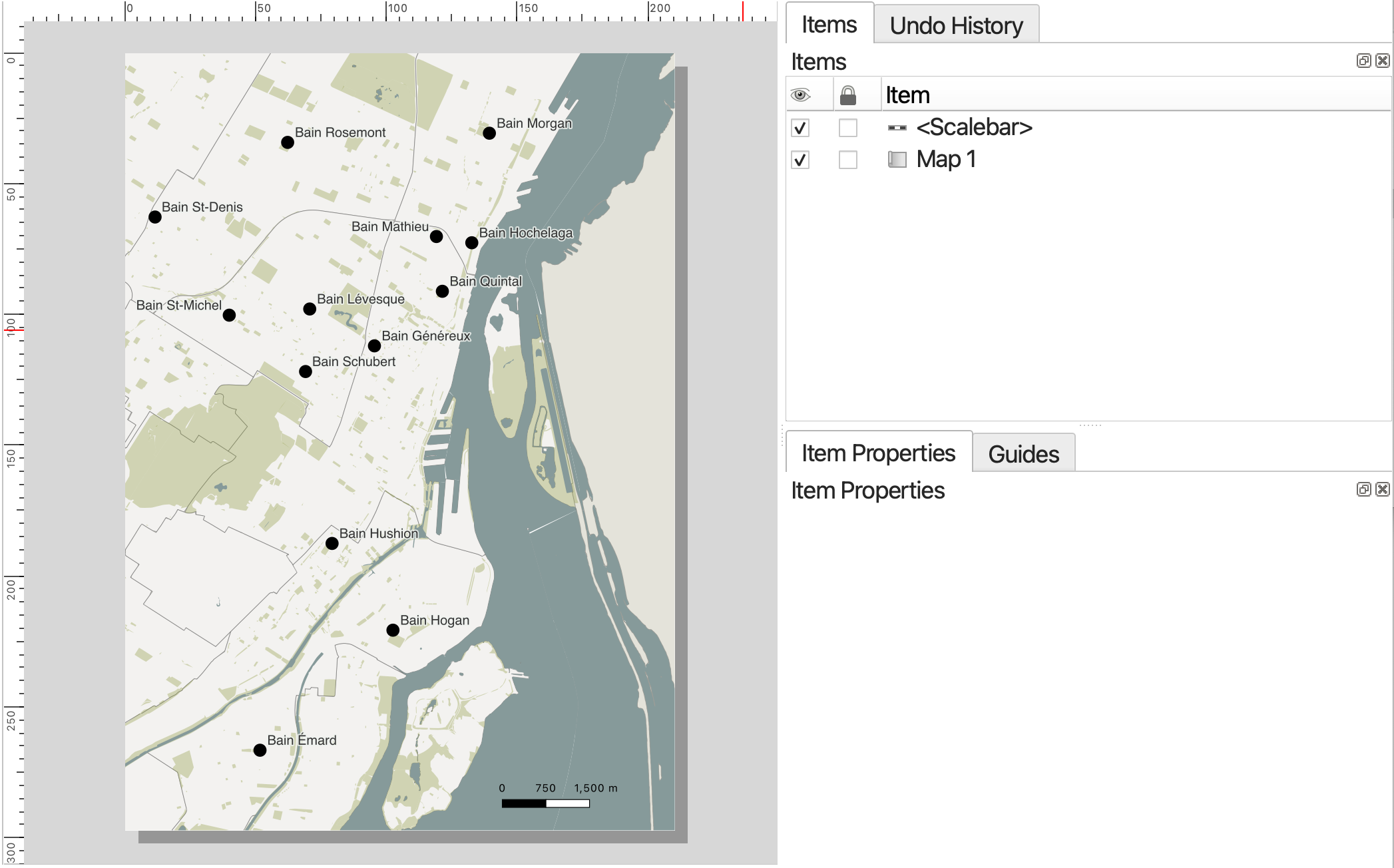
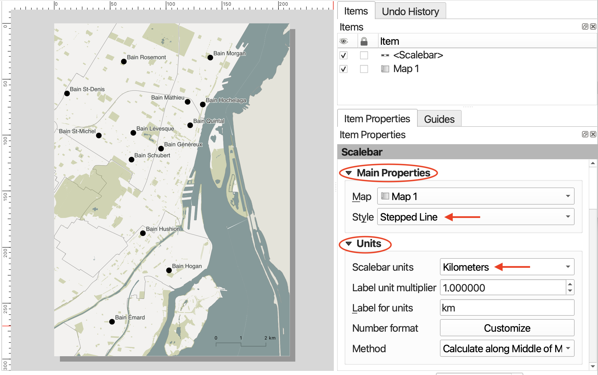
Best practice is for your scale bar to be in metric units.
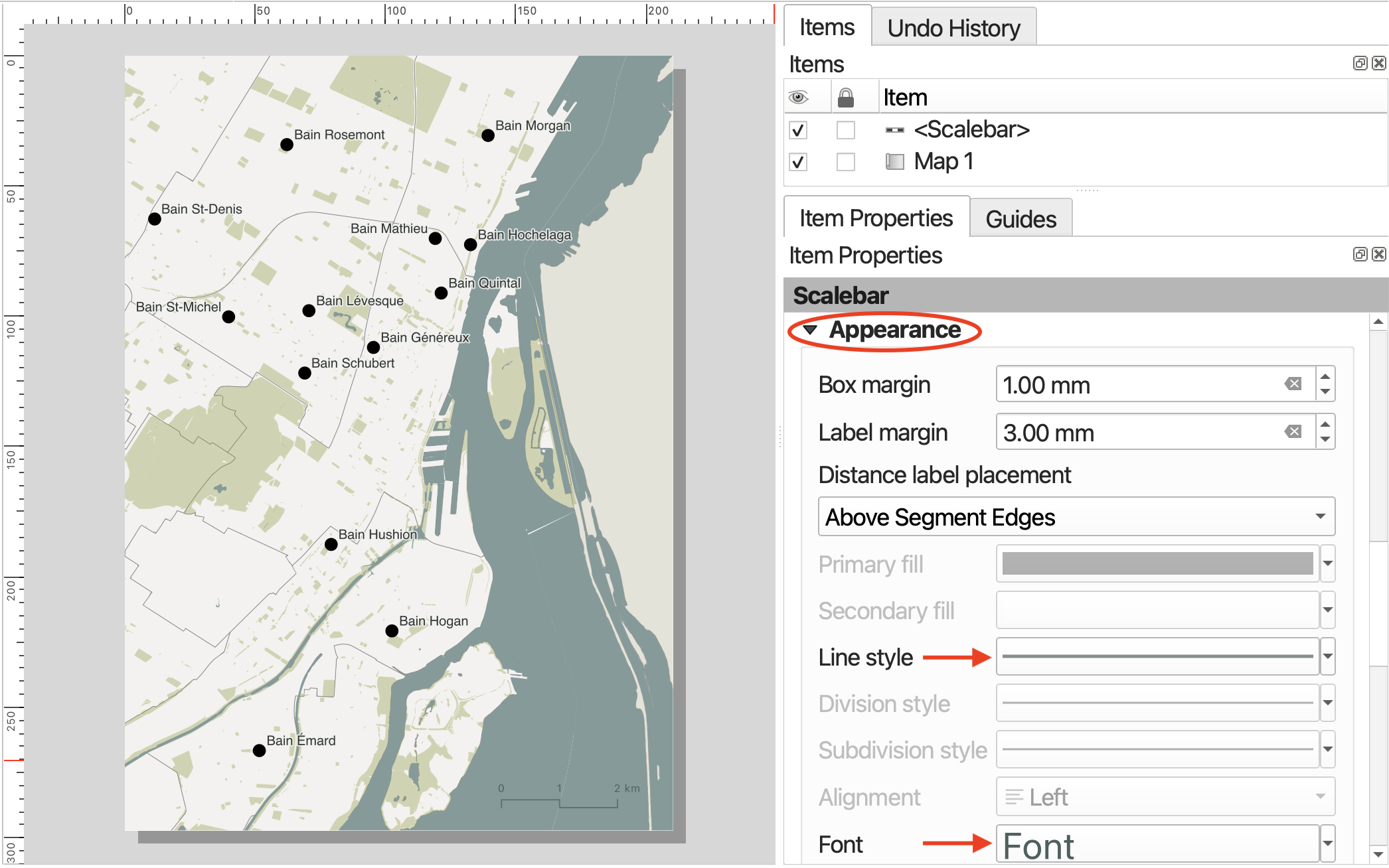
To customize the symbology of your scalebar as well as its lettering, scroll down and expand the Appearance option. Click on Font in Appearance to change the font family and color of your scalebar labels. Thinking about Visual Hierarchy, perhaps the scalebar and lettering could be a lighter in color, or slightly transparent. Consider matching the lettering and line color with the water or other extensive features.
Add a north arrow
Add a north arrow.
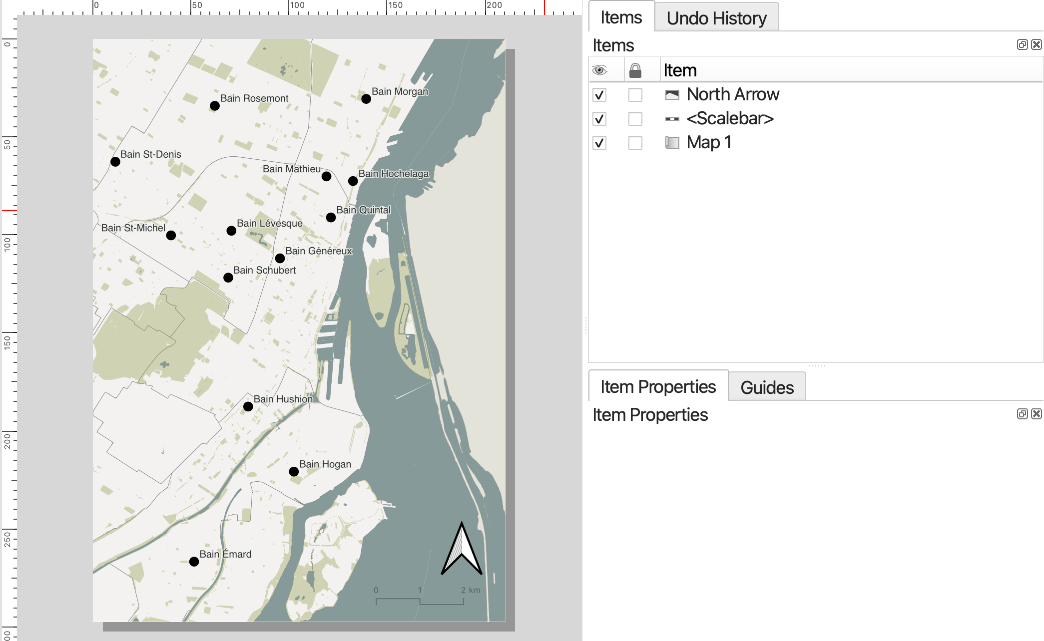
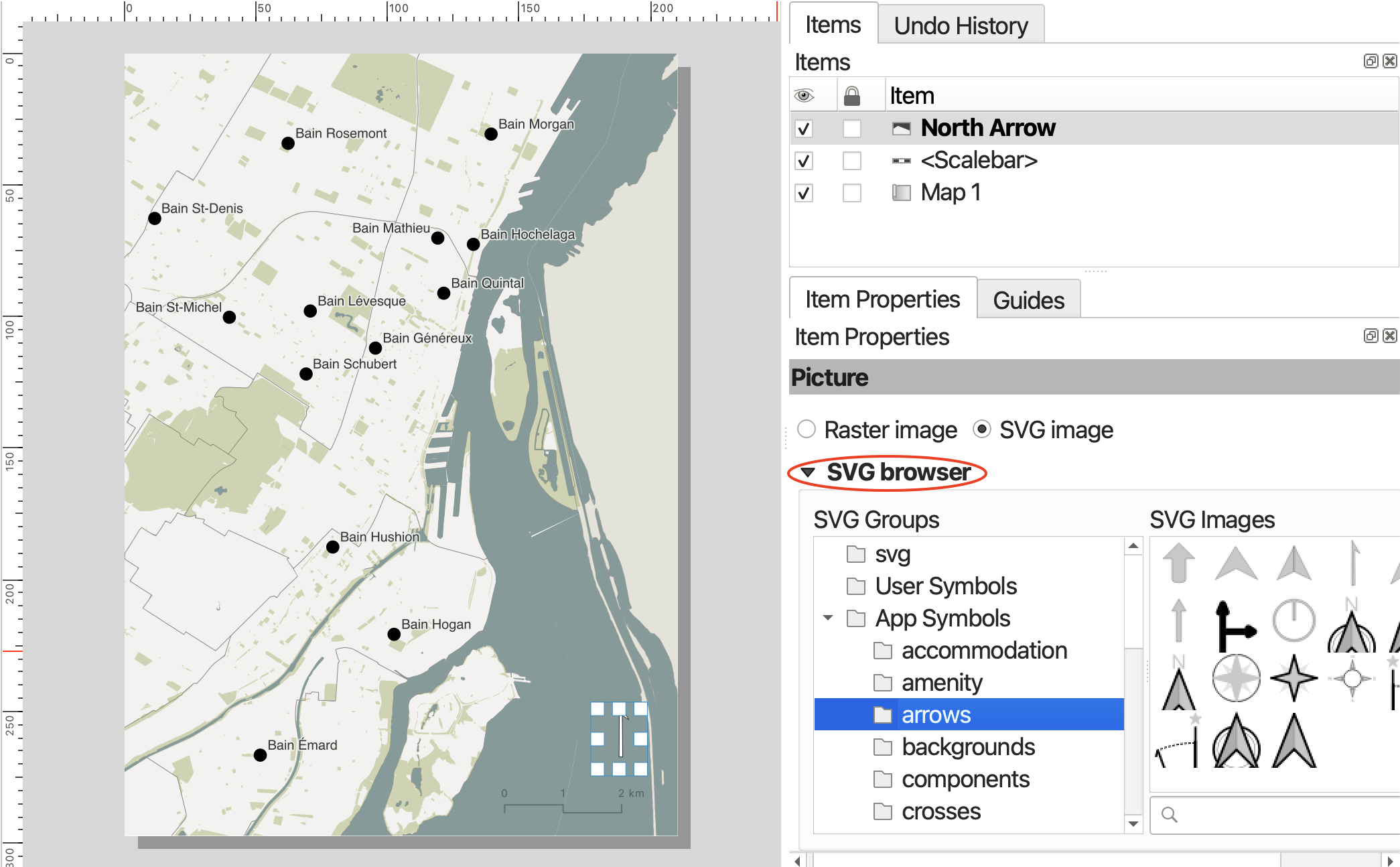
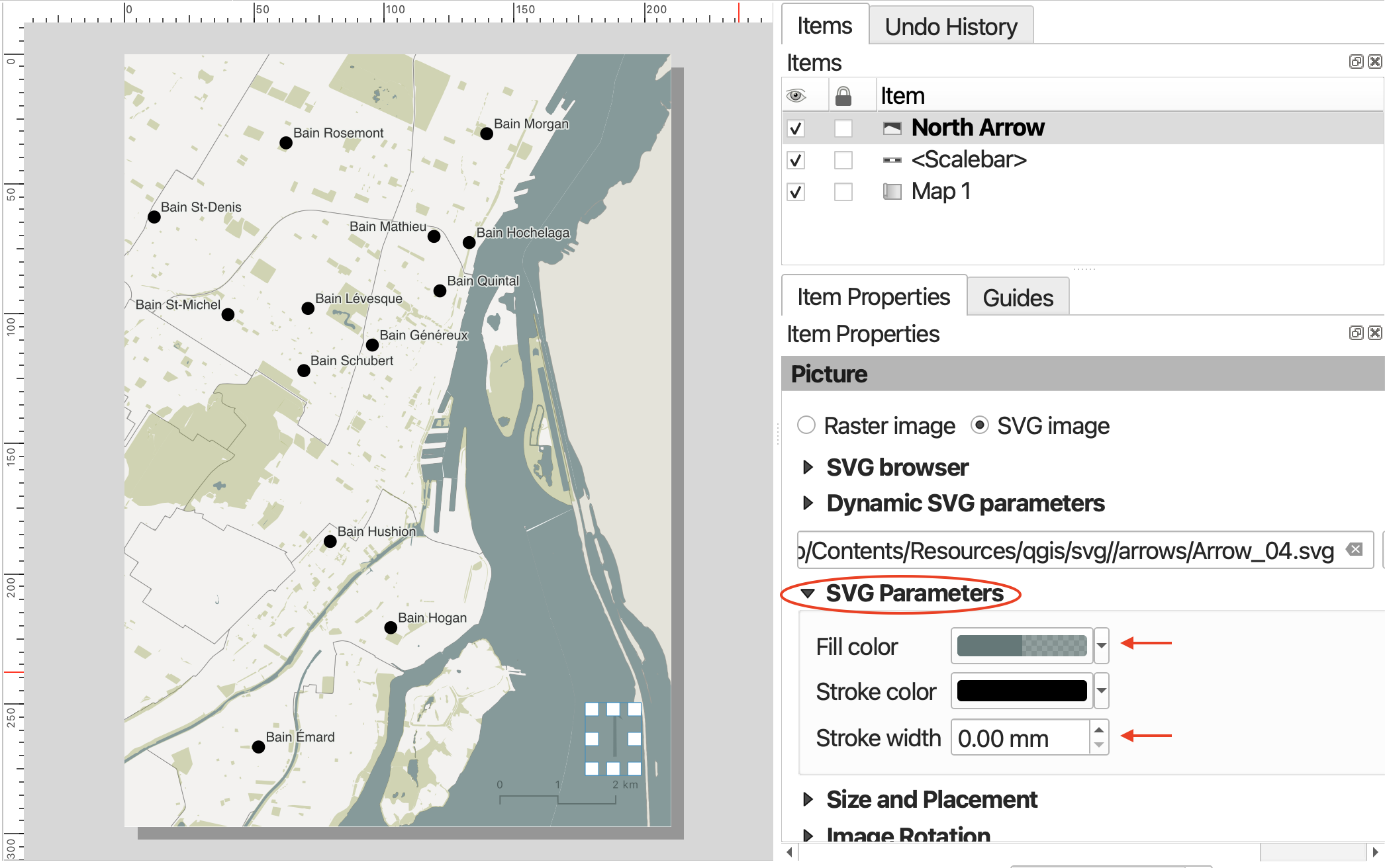
If you scroll down to “Image Rotation” in Item Properties, you will notice there’s an option to choose either Grid North or True North. Grid North is relative to the projection used, whereas True North, like the name implies, is a fixed geographic location. According to QGIS, Grid north is the direction of a grid line which is parallel to the central meridian of the national/local grid, whereas True north is direction of a meridian of longitude. You can try changing it - at the scale we’re interested in it won’t matter.
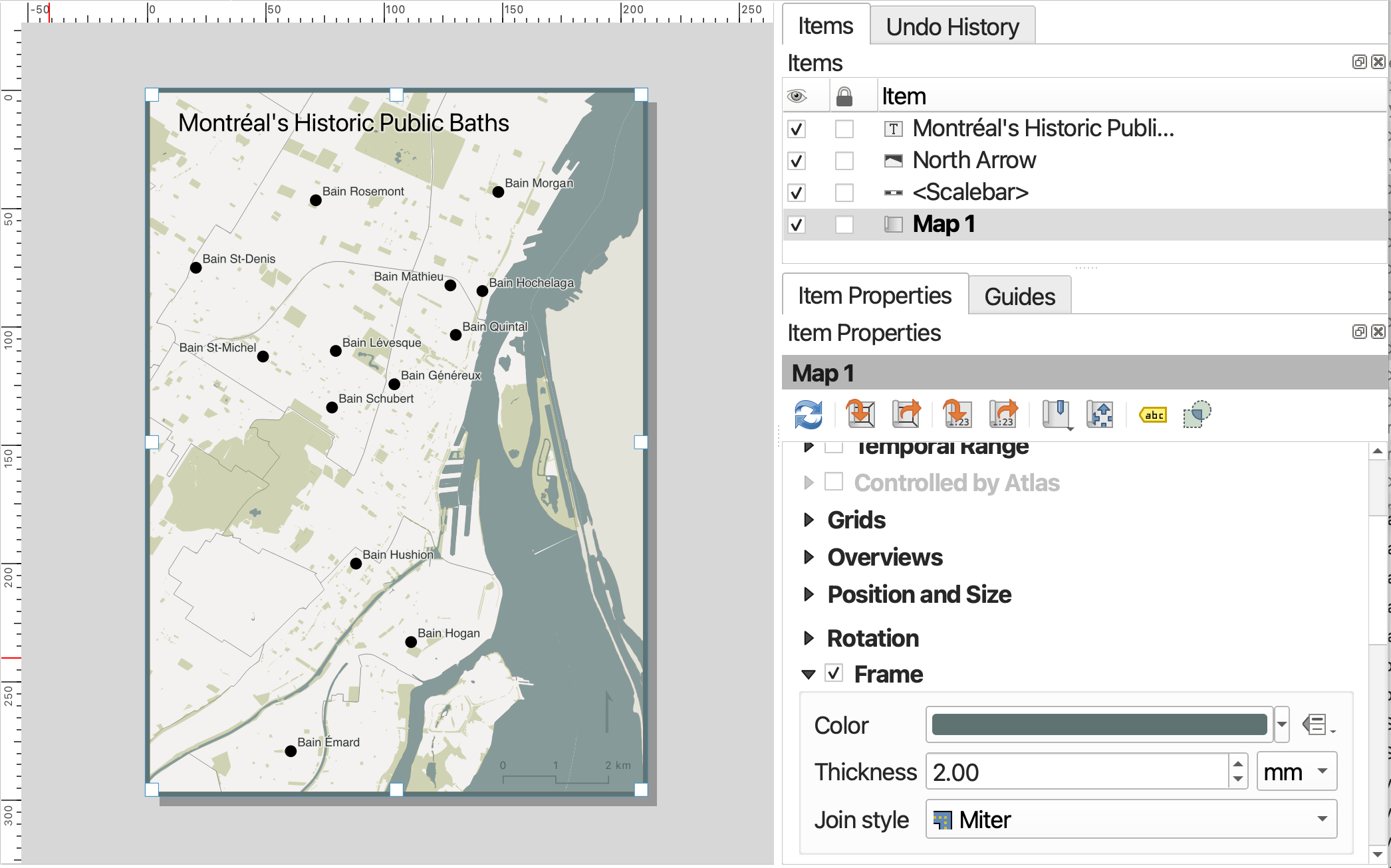
Add a Neatline
The border around your map frame is called a neatline. You can add a neatline by turning on the Frame option of your map item, and then styling it. Be sure to click back into your Map item in order to expose this item’s properties.
Add Text: Title, Data Source, Map Author
Although you can add a title and other labels to your map based on layer attributes in the main QGIS interface, you can also add individual text labels, including place names as well as titles and attributes/data sources to the Print Layout via the Add Labels item.
Go ahead and add a label for this map such as “Montréal’s Historic Public Baths”. To increase the font size and spacing, scroll down in the Item properties and click on Appearance. You can increase the spacing to stretch a title label across the extent of a feature.
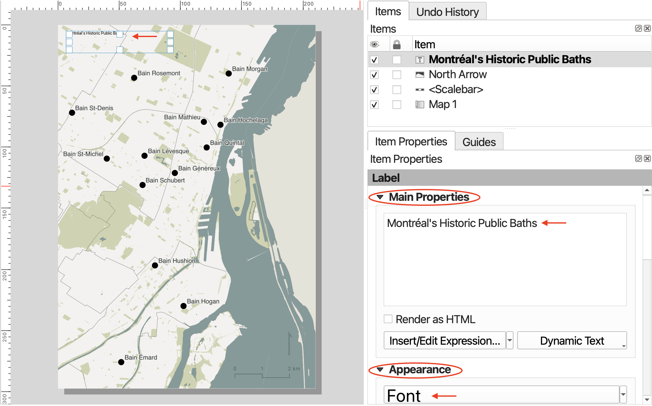
You can up the size, font, and color by going to FONT under the Appearance option.
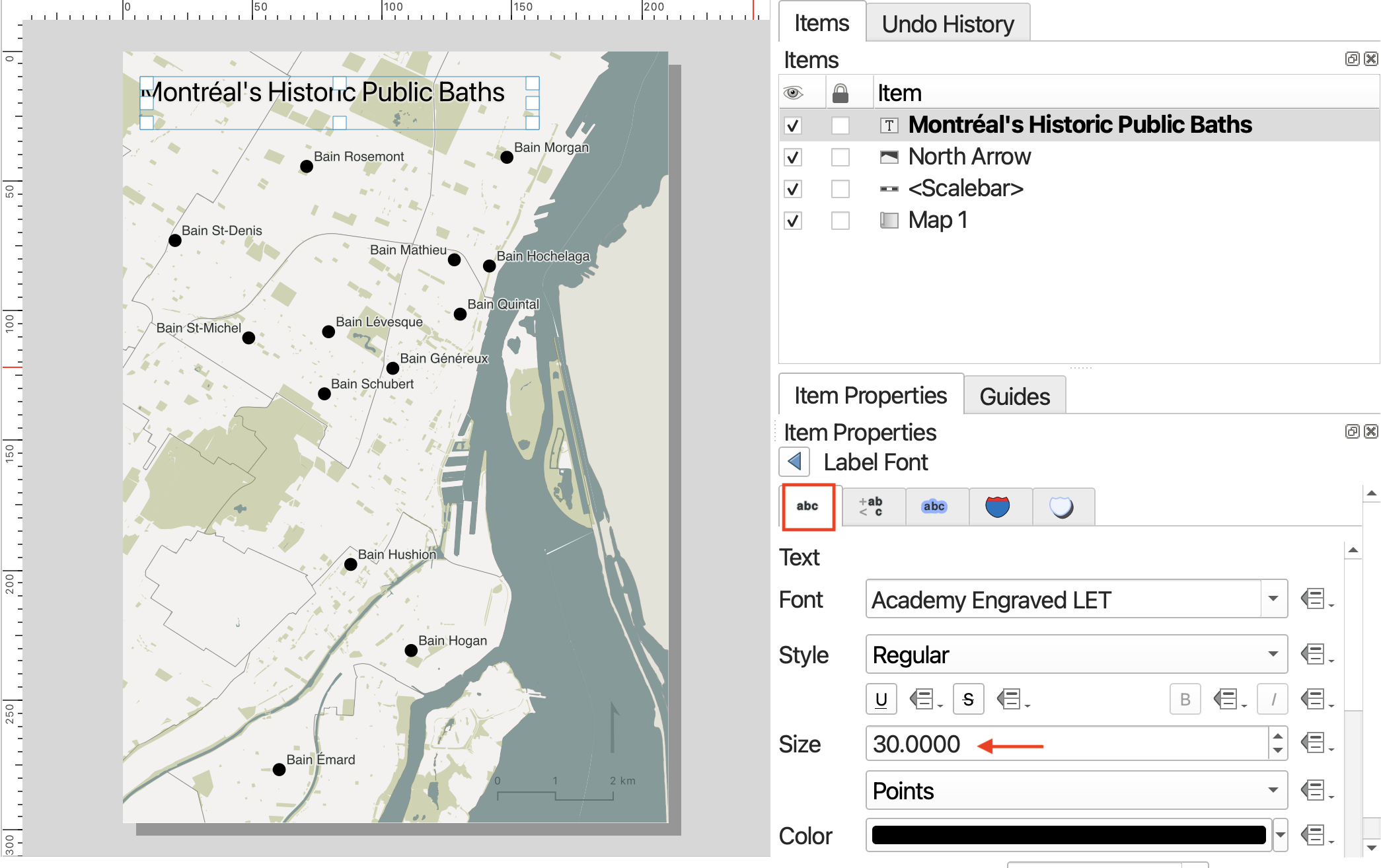
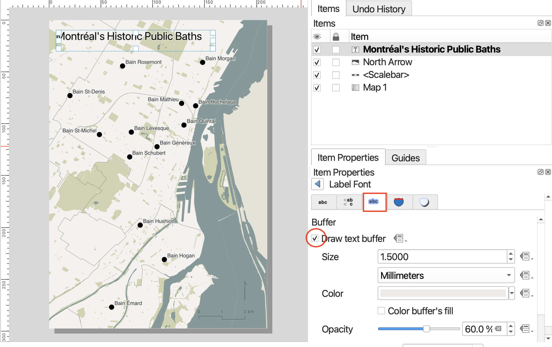
You can click over to add a buffer.
Visual hierarchy tip: add a semi-transparent buffer around the title in the same color as the background.
At the bottom of your map, just above the neatline, it’s customary to include the map author and data sources. This can be added as a label. The sources for this map are the City of Montréal and the Government of Canada, as well as Alex Alisauskas.
Add a Legend
We don’t need a legend here but if you were to add one, you’d add it from the Add Items menu.
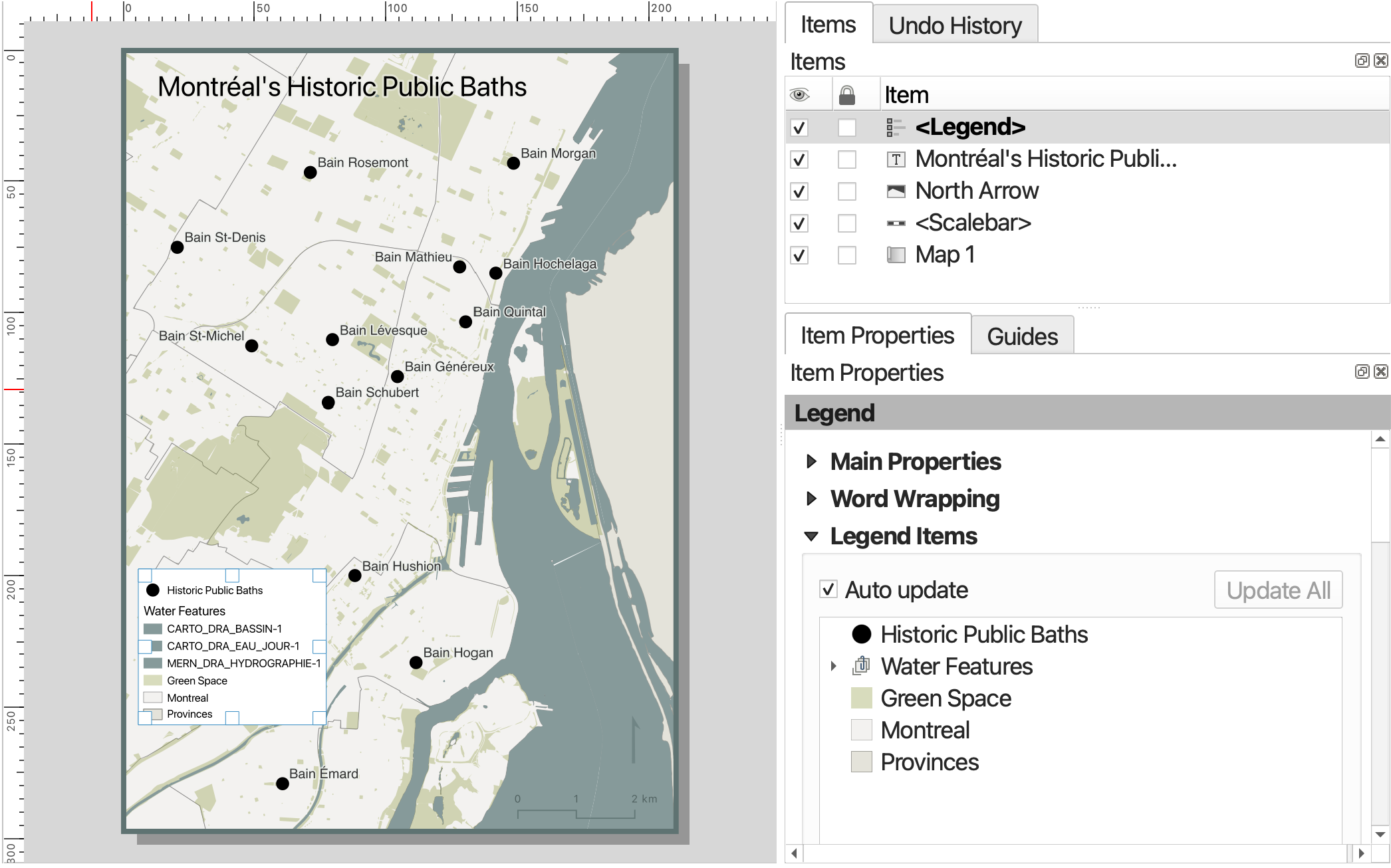
Only features symbolized by your map should be included in your legend. Additionally, the names of relevant layers should be updated so they are understandable to the viewer.
To change the names or remove items from the legend, In the Legend Items section, collapse Main Properties so you can see Legend Items. Now, uncheck the ‘Auto update’ box. To remove any unnecessary layers, select the layer you want to remove and then click the big red minus sign. You may need to collapse the layer and scroll down. To rename a Legend item, simply double-click on the item and type in the text box that opens. Remember to click the back button to return to the the item properties. You can also go down to the background property and adjust transparency or remove altogether.
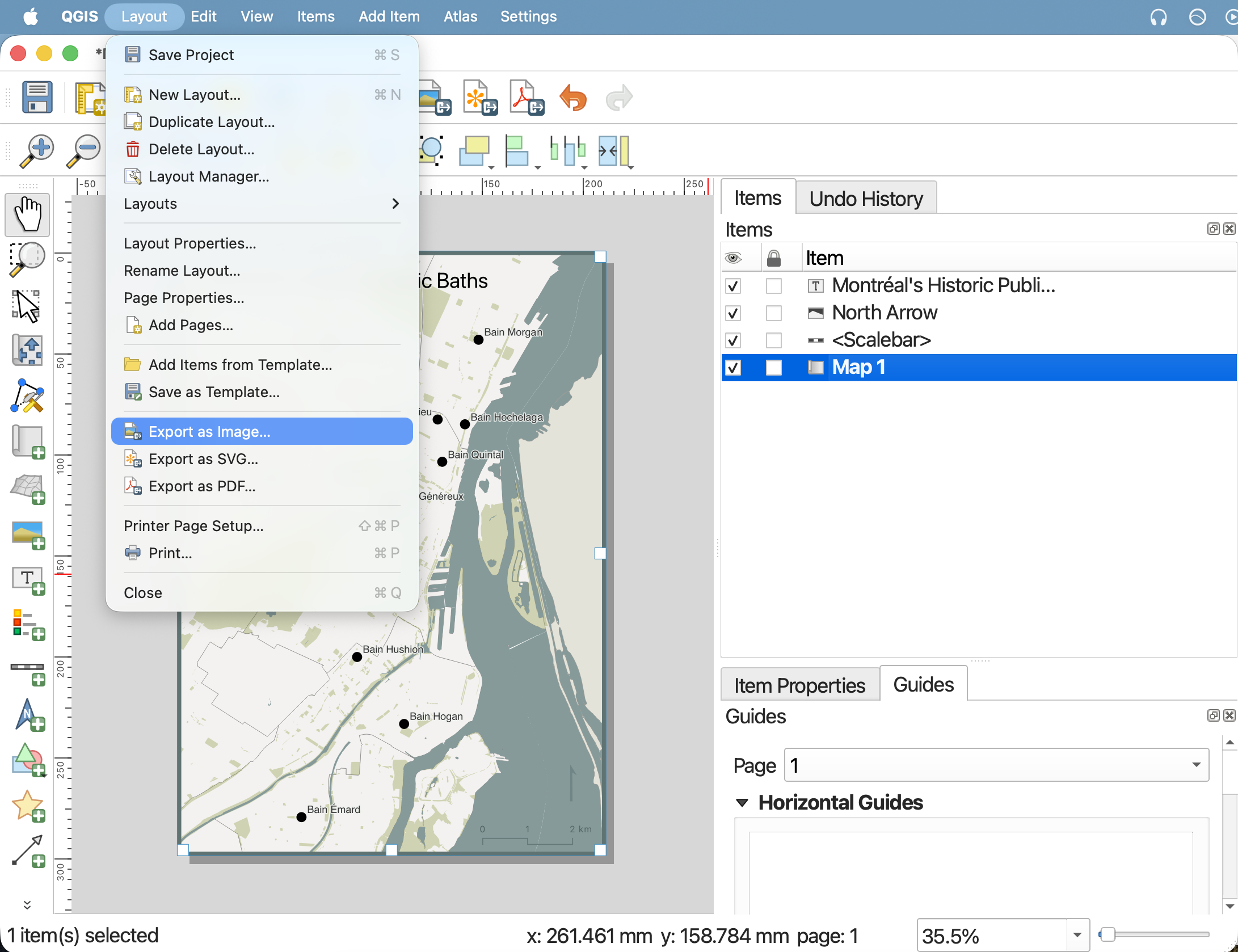
Export your map
You can export your map as an image, PDF, or scalable vector graphic (.svg) from the Print Layout toolbar, or from the Layout menu. You can also print your map directly from QGIS.
When exporting as an image or PDF, you will be prompted to enter the resolution. I recommend increasing the resolution to at least 450dpi, otherwise your map will be blurry.
![]()
Congratulations! You’ve just made a map!
Before you close your QGIS project, save your Print Layout and your Project too.
Loading last updated date...